
Logo history

1. 1908–1965
2. 1965–1989
3. 1989–1996
4. 1996–2001
5. 2001–2012
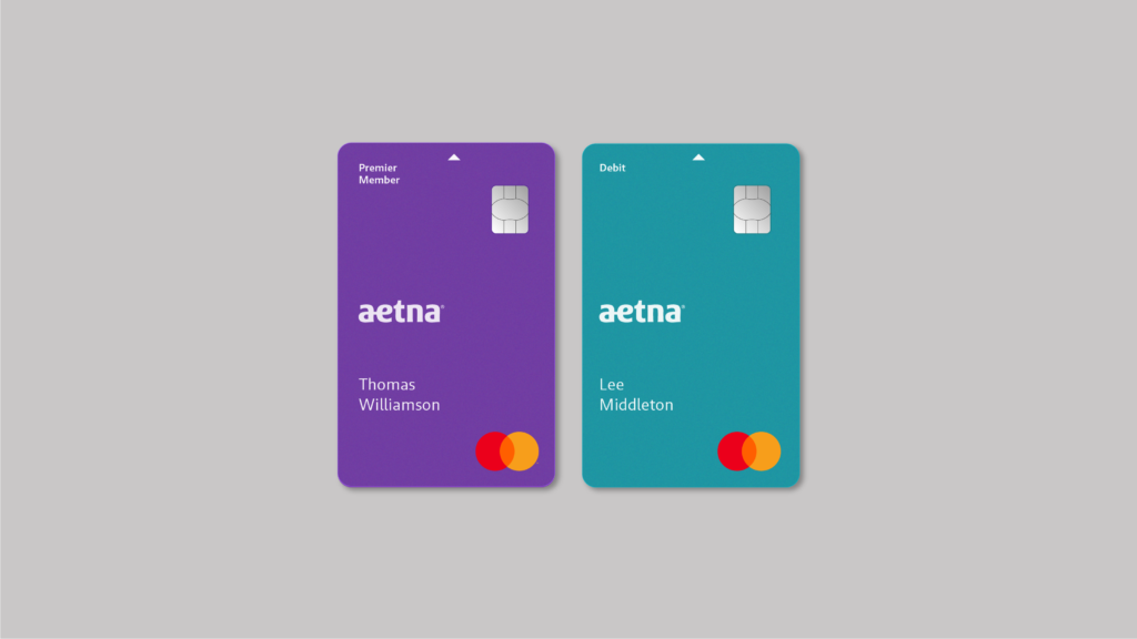
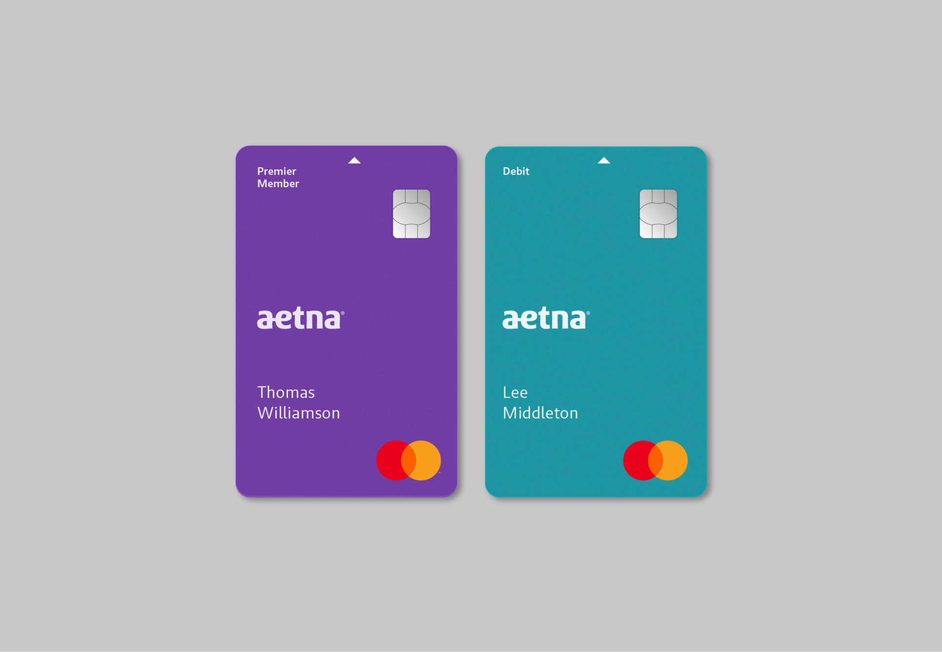
6. 2012–Present
Summary
The Siegel+Gale team asked Abbink to help envision and design what would become the new wordmark for Aetna, one of the nation’s leading health care companies. The team had created the new brand strategy, preliminary visual explorations and realized the wordmark had to be custom-drawn to reflect the team’s vision.
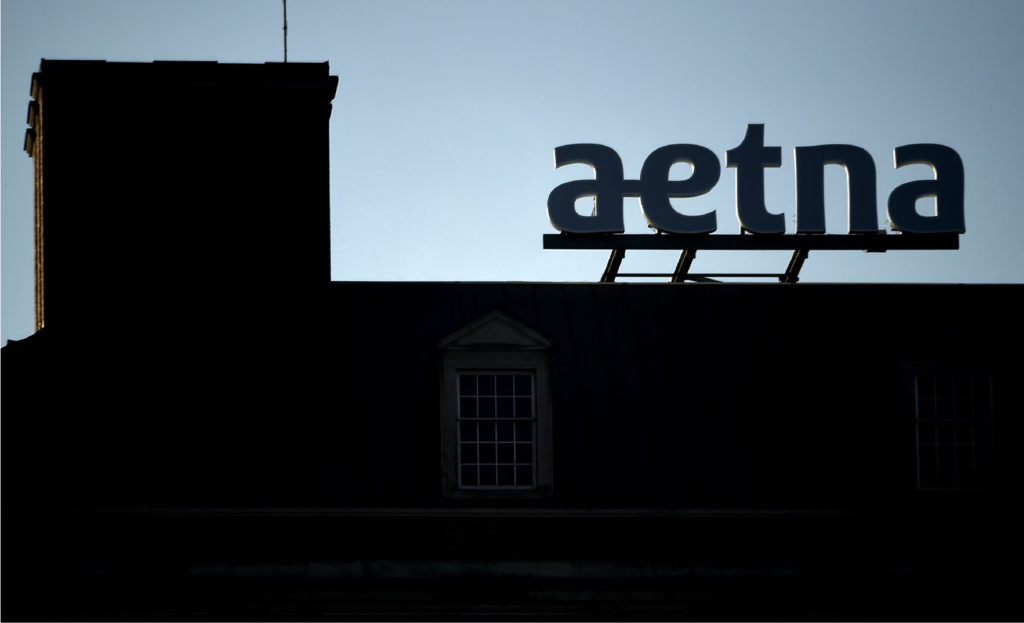
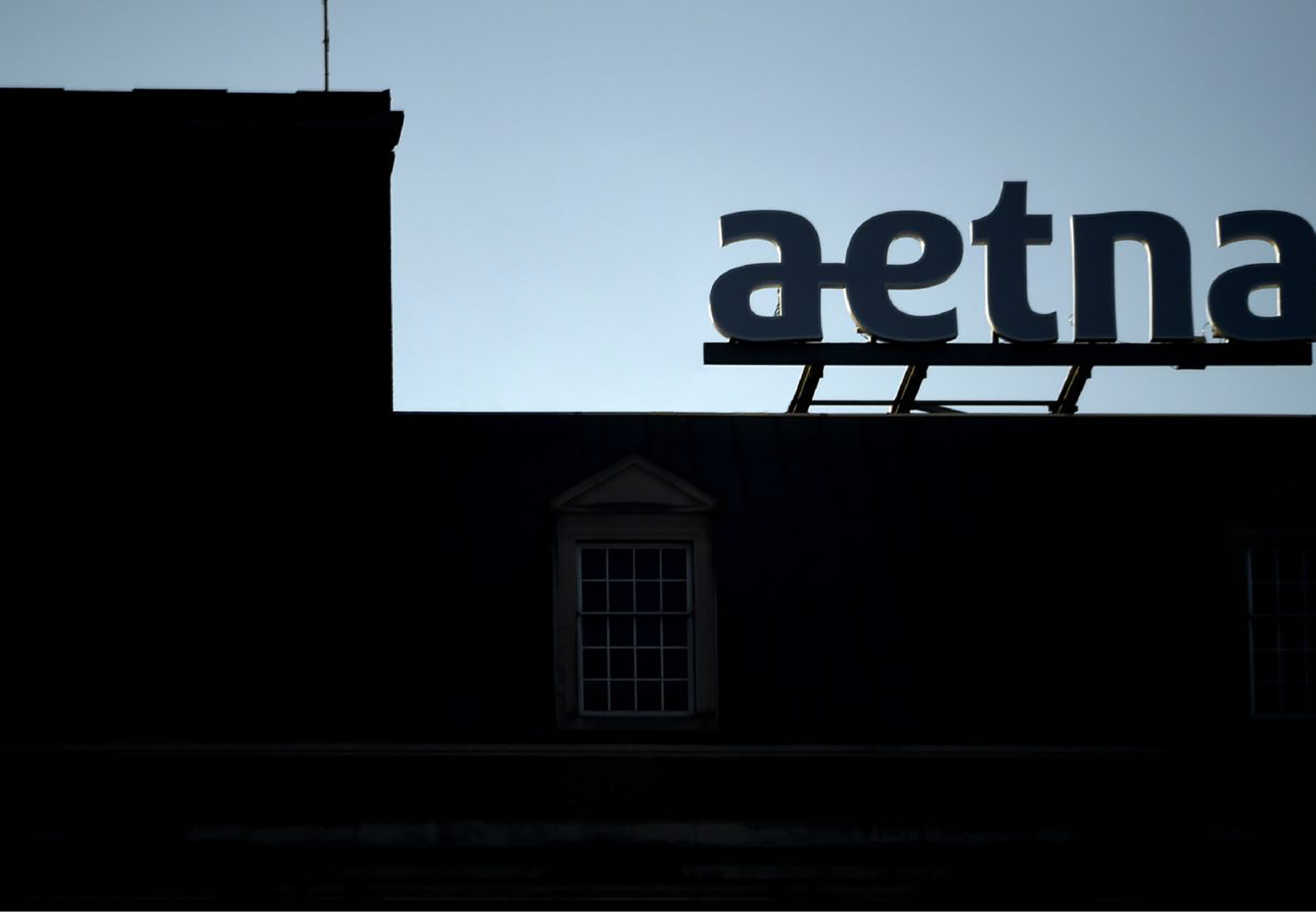
Aetna’s new logo had to reflect the equity in the name and its long lineage of symbols. The inclusion of a connecting “a” and “e” symbolically addresses its 160-year history, dedication to building relationships, and the brand promise of a connected health care experience. The recognizable ligature of the two letters was used in the Aetna logo for 151 years before retiring in 2001. It returned as a unique symbol of Aetna’s brand and its heritage.
Credit & details