

Visual system
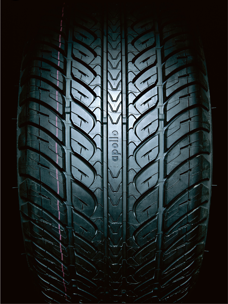
The sun god and tire-inspired graphic pattern reflect various tires from large tires used in agricultural vehicles to passenger vehicles and across radial and cross-ply tire types.


The Apollo graphic pattern expresses its dynamic spirit and Indian culture. The design is engineered and spaced to create rhythm and playfulness.


The center point is the anchor for cropping and beginning the pattern.


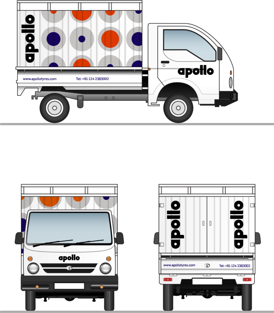
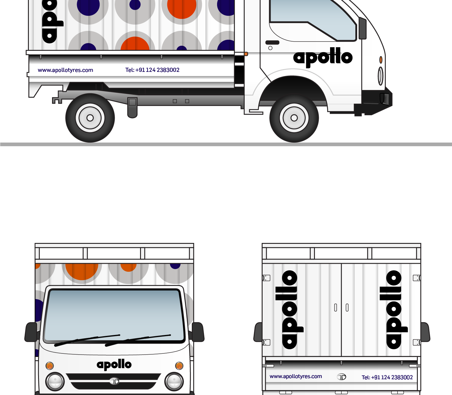
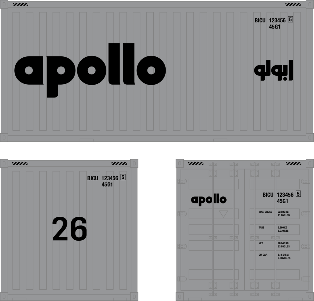
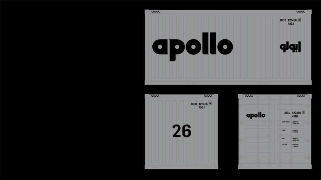
Livery design
for Tata Mini-Truck
↓

Signage system
Product naming


Corporate typeface


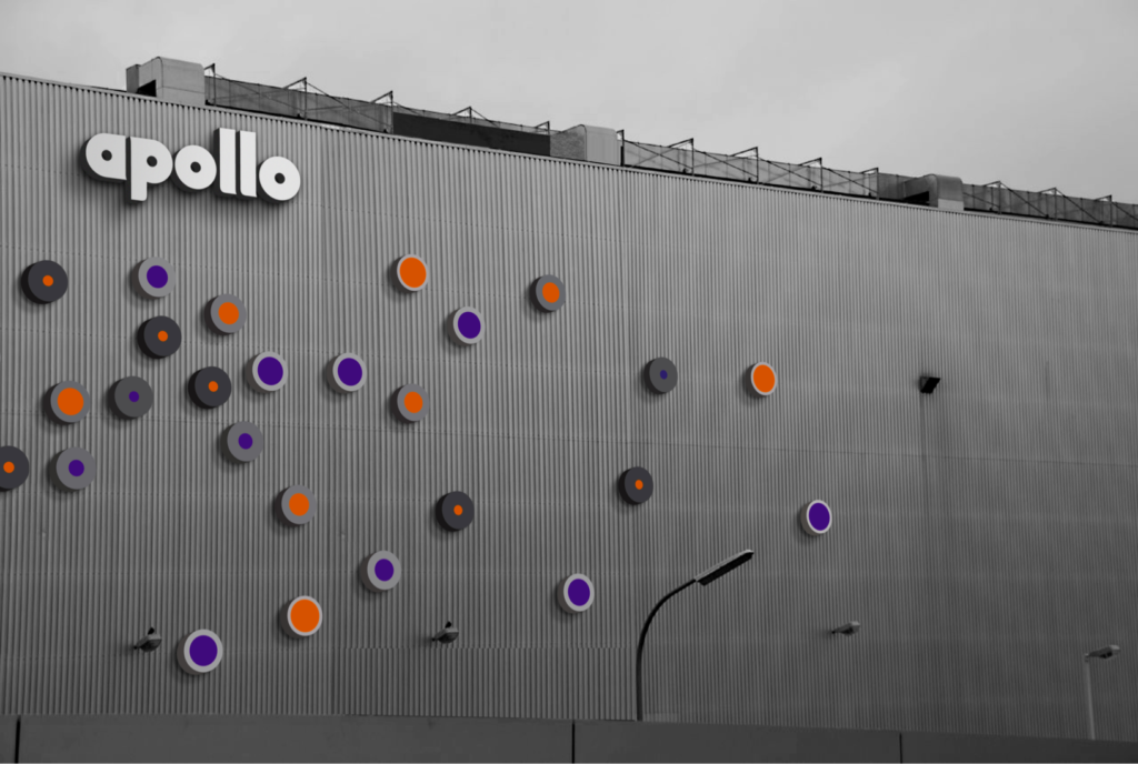
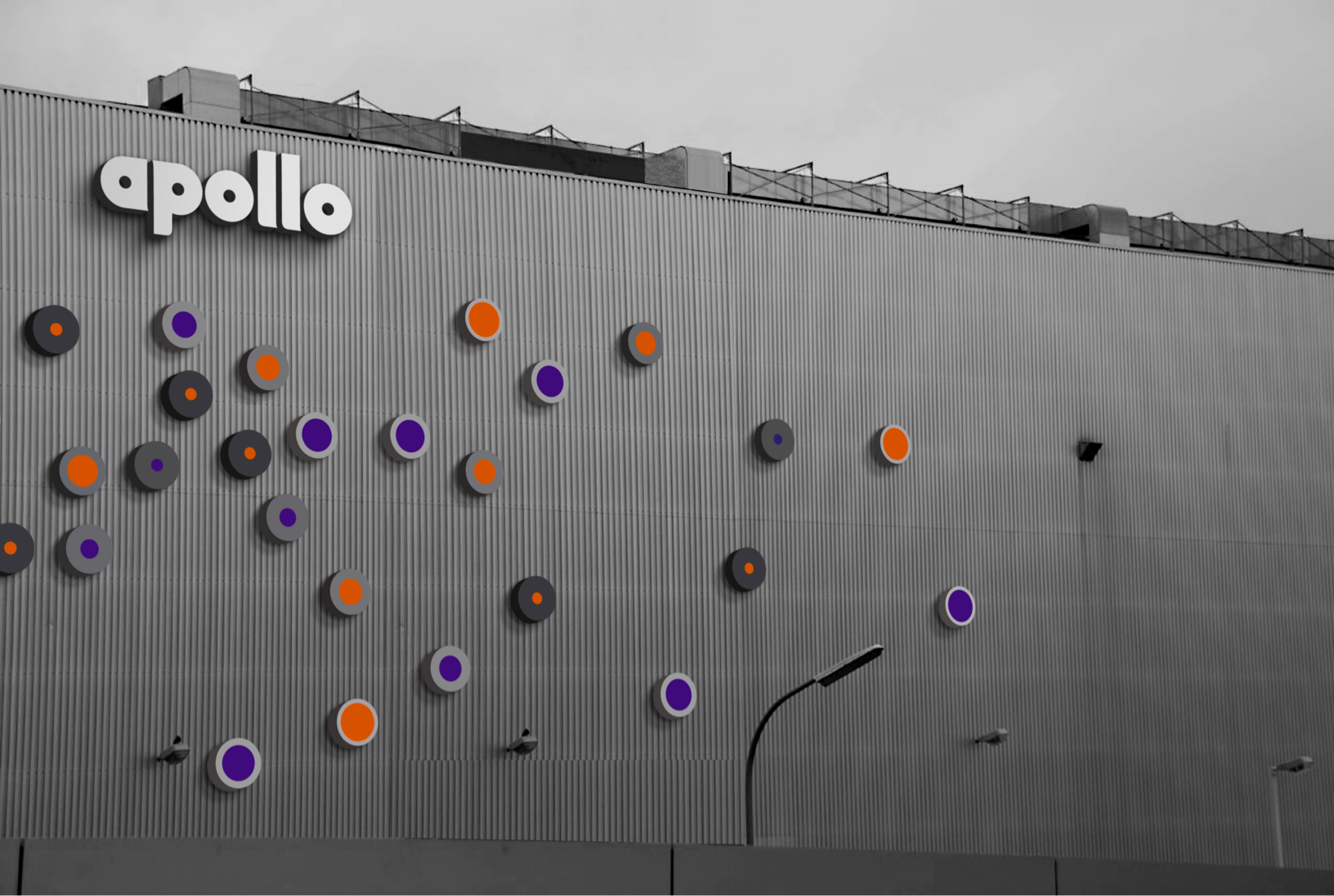
Plant signage
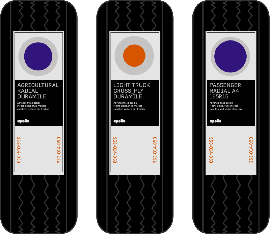
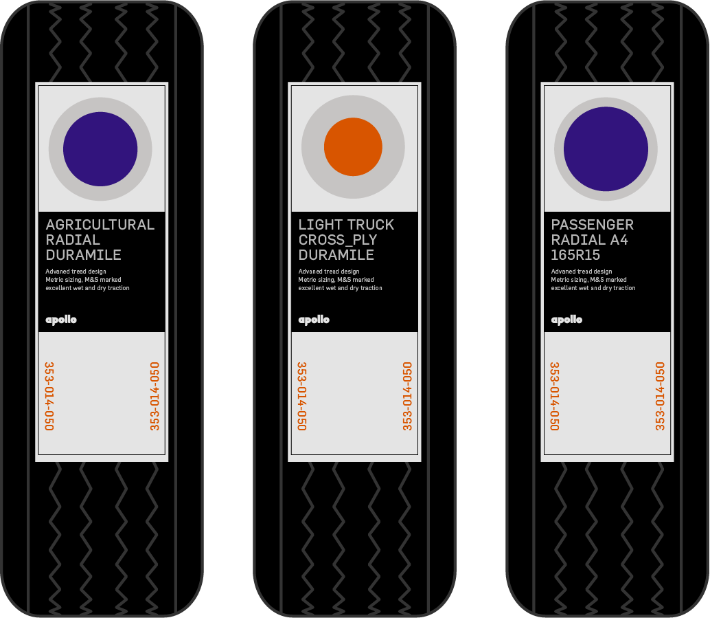
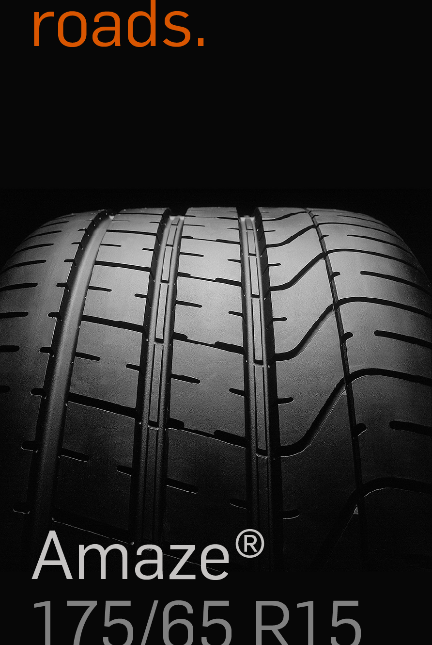
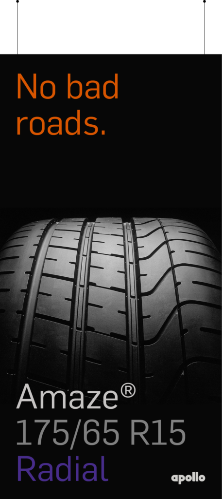
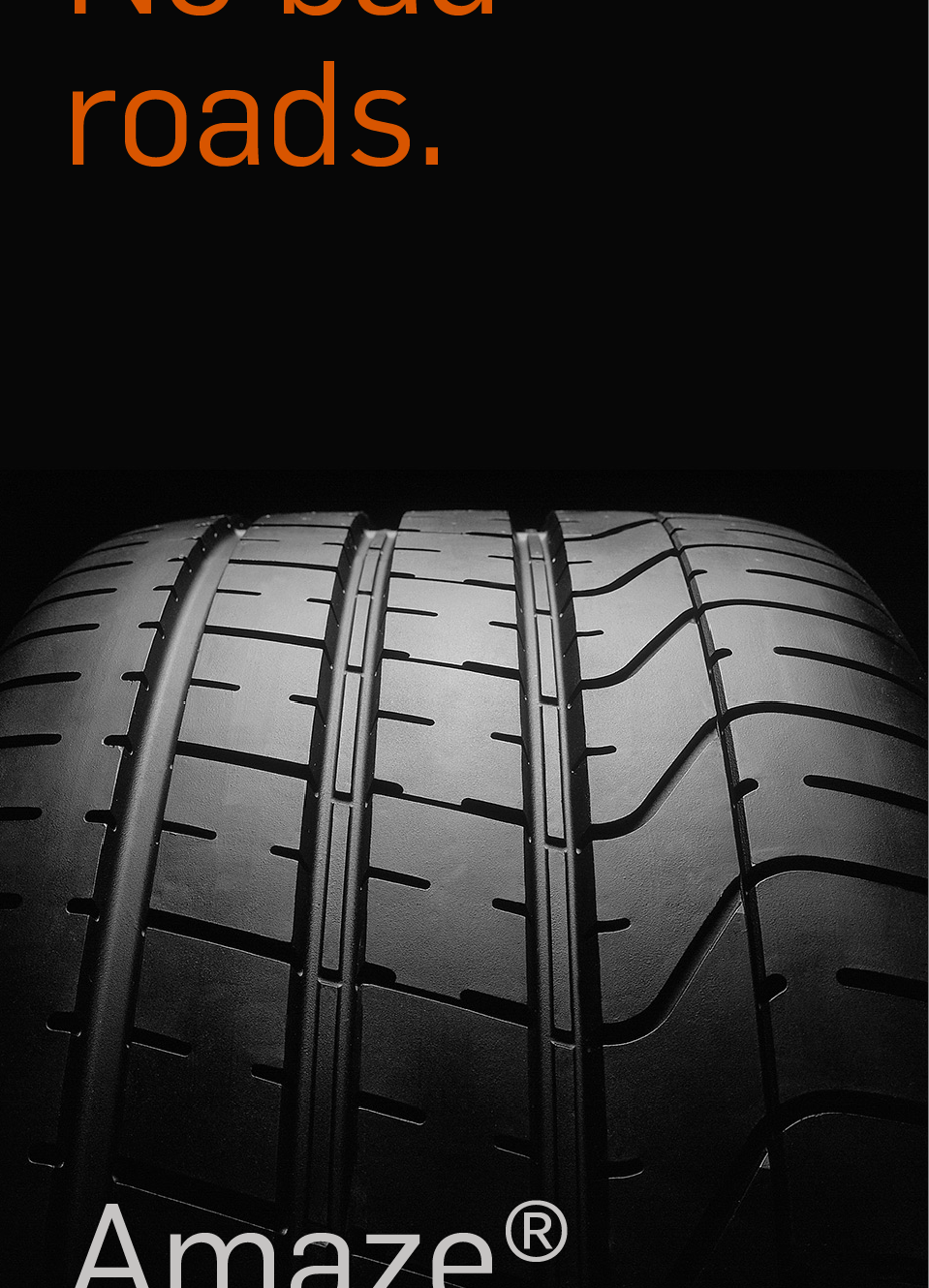
Sticker based
product sheets
for retail


1:3 with grid


1:2
1:2


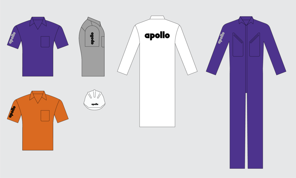
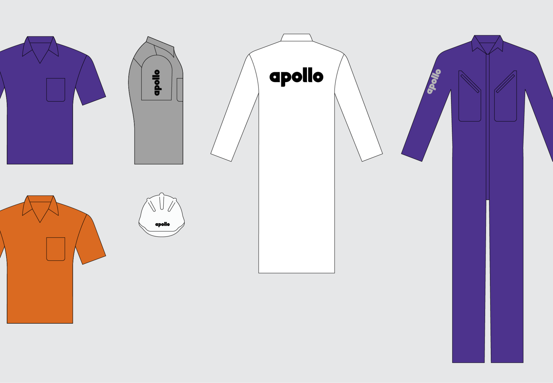
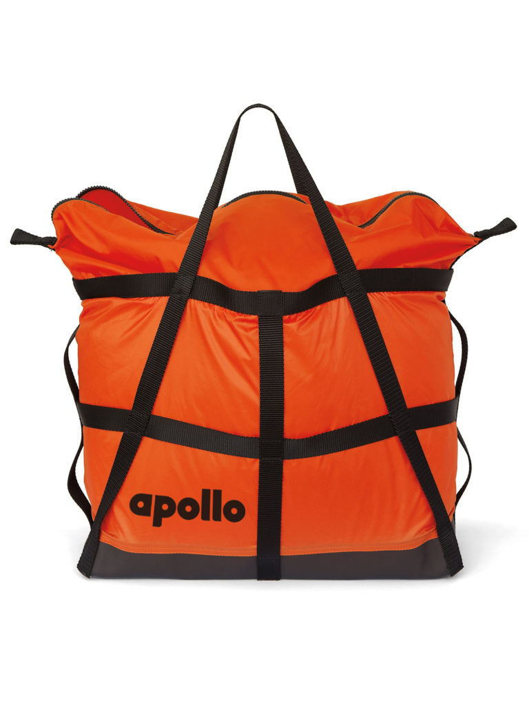
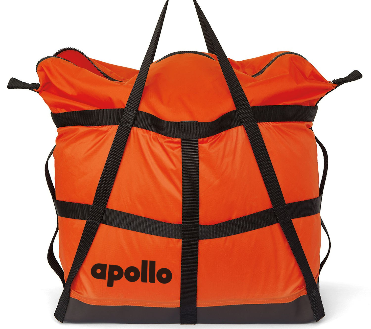
Branded merchandise


Summary
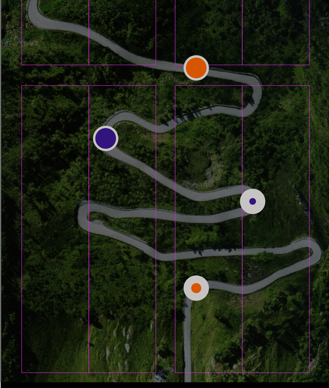
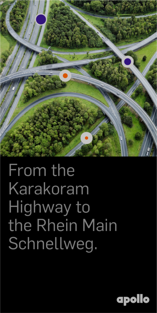
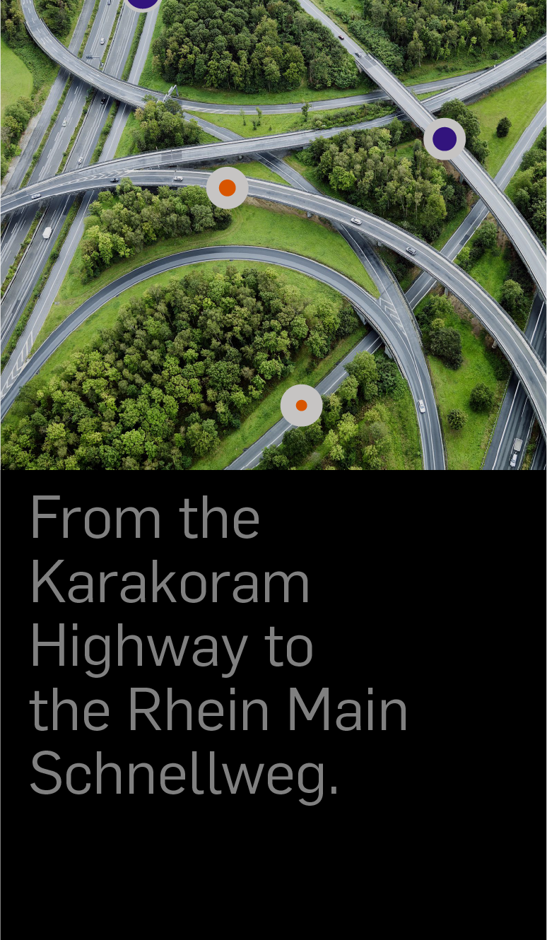
Apollo Tires required change as they were about to embark on the European marketplace, starting with Germany and the UK, challenging markets to penetrate. The current brand was not differentiated against the typical macho tire companies, and they had not embraced their Indian roots. The design strategy was to celebrate the company being from India and use that to help differentiate and create more authentic communications. The visual system expresses what Apollo does best—to make the best workhorse tire at an excellent price point. This expertise came from not developing tires for the autobahn or race track but, rather, the harsh road conditions in India and from large industrial vehicles. As a result, the system became a colorful, authentic expression with a unique story that placed them in their own category, but now as a leader.
Credits & details