

The original “k” (left) and alternative studies including the final direction


Optically balanced
joint relationships.

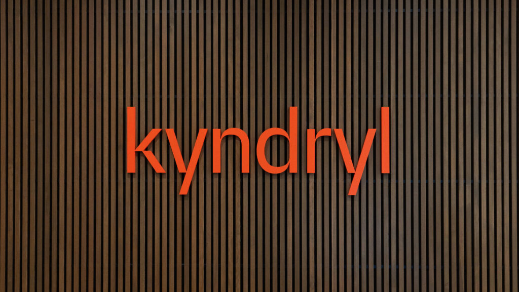
Relationship sets with the “kyy” and “ndr” and the single vertical stroke of the “l” also traverse across the sets and letters — “kndr.” These groups also create a unique rhythm when they come together as “Kyndryl.”

The strong angles in k are the basis of a graphic pattern and hero graphic designed by Landor.

Visual identity by Landor
Summary
The role was small but mighty — to refine a wordmark concept presented by Landor to the IBM and Kyndryl executive leadership and craft the final version. Landor was developing the new brand strategy and identity system for Kyndryl and needed a unique wordmark that reflected the dynamic spin-off of IBM’s IT infrastructure service business with 90,000 employees right out of the gate.
There were vital considerations to explore in the wordmark — the design of the letter “k,” the letterspacing, the letter proportions, curves, joints, and weight of the letters. The initial “k” in the concept presented lacked a decisive point of view, and as the first letter in such a unique word, it demanded one. There was also an opportunity to build a formal relationship with the two y’s constructed with two simple diagonal strokes. Using the same stroke logic from the “y” to create the “k” became a clear direction to pursue.
The final wordmark is distinct and delivers a “k” with significant results — the right amount of attitude, a harmonized relationship between the letterforms, and informs a robust graphic pattern used to express the brand.
Credits & details