
Historical references from NBCUniversal archives show various typographic styles used for both NBC and Universal Films that capture the golden age of film and broadcast.
Archival images
supplied by
NBCUniversal
Brand team.
Bespoke typeface: Rock Serif


Bespoke typeface: Rock Sans


Rock type family


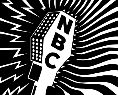
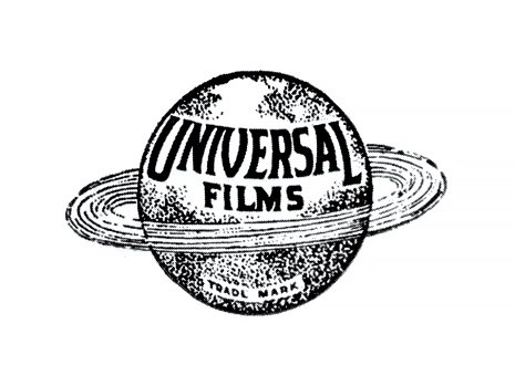
NBCU Rock Serif takes influences from the Copperplate Gothic inspired from the Universal logotype. These features help retain the lineage and history of the business.


Ligatures are
available in Rock
sans and serif.
The sans serif retains some details from the serif companion but also takes on features from the gothic and grotesque styles used for NBC throughout its long history.


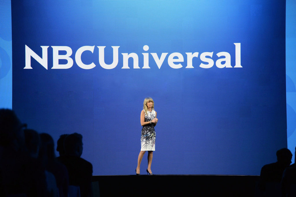
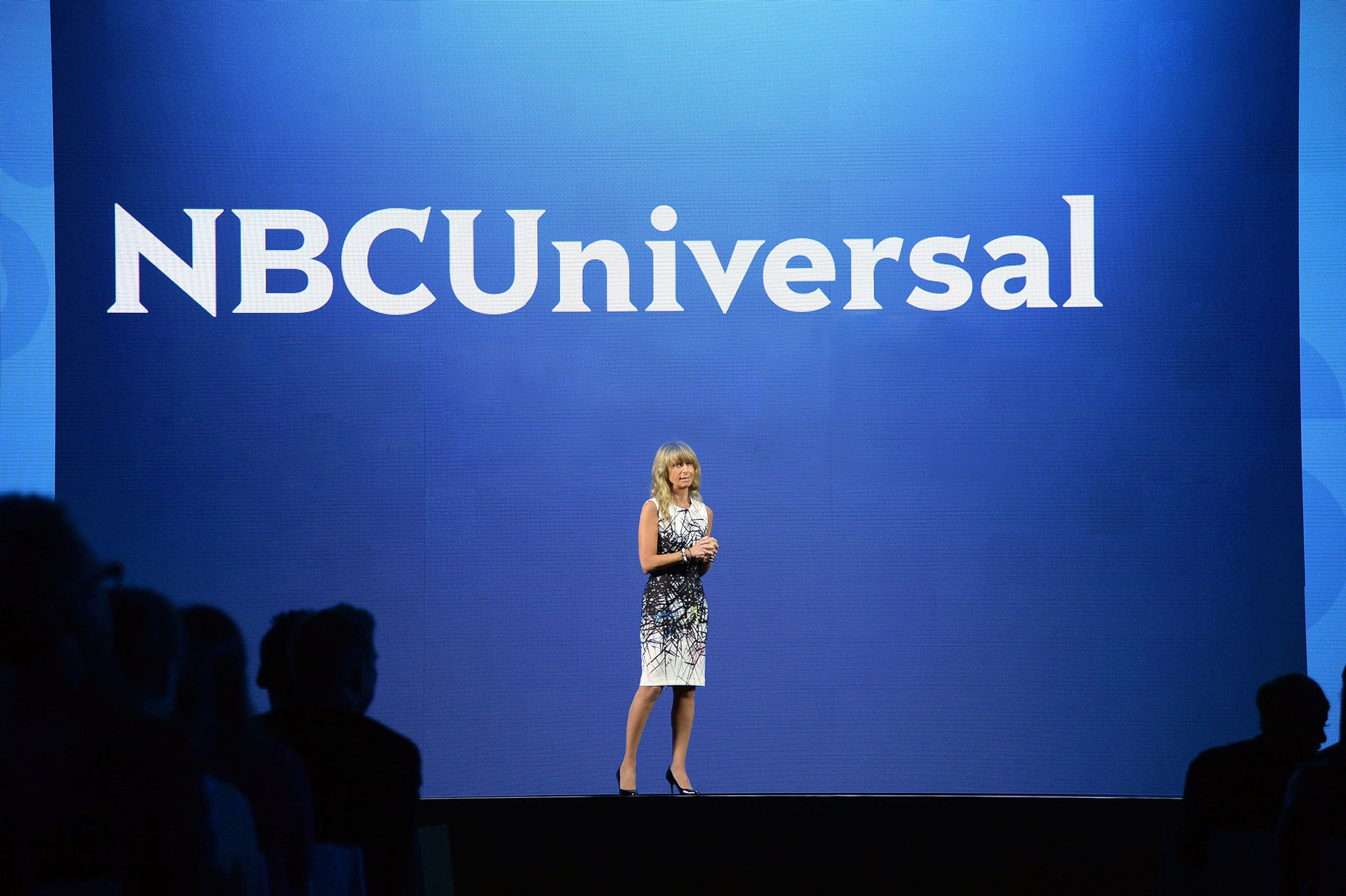
Rock Sans complements the NBCU logotype within the division and department lockups used across the business.


Summary
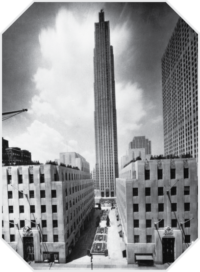
The new merger with Comcast demanded a strong point of view and an equal presence between the brands. The new logotype stands as its own identity and represents the whole company, and it is designed to better coexist with all of the brands in our family. While the new design solution removed the peacock and globe, the new logotype celebrates the company’s heritage in new, more subtle ways. It unites elements from NBC and Universal’s storied legacy — like the Art Deco feeling of Rockefeller Center and the silver screen sophistication of old-school Hollywood. The logotype also drove a new corporate typeface family named Rock, playing a vital role in the new brand expression.
Credits & details