
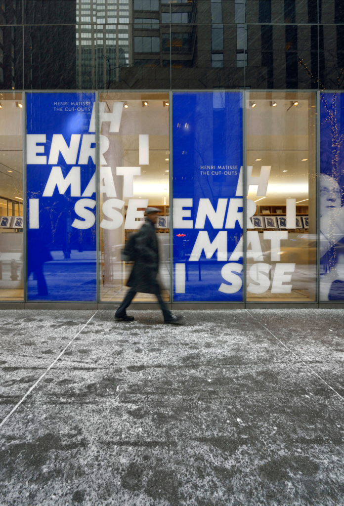
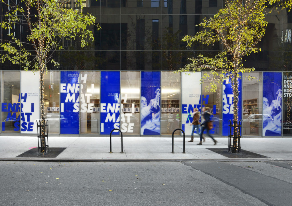
MoMA Store front

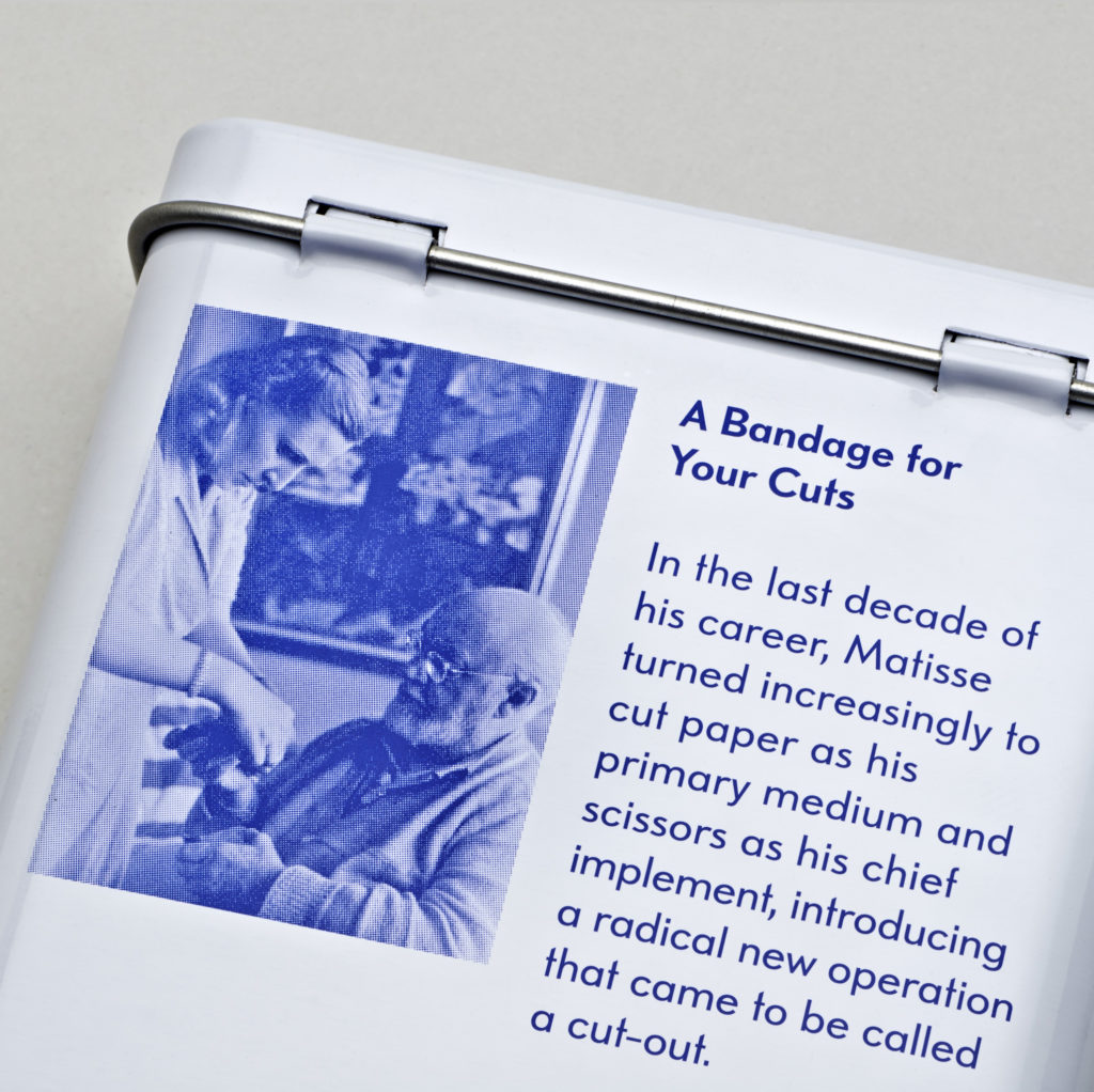
Retail system


Summary
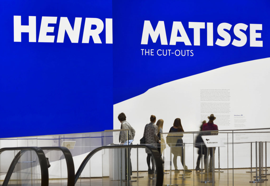
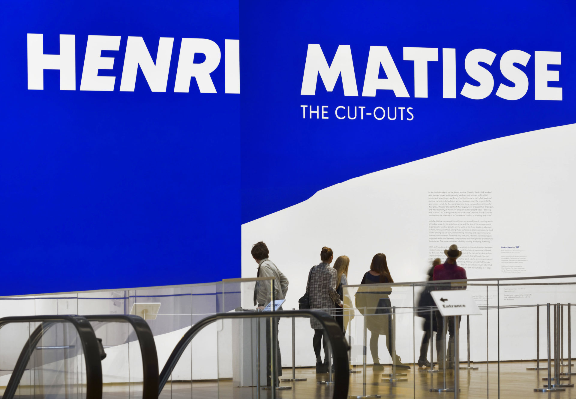
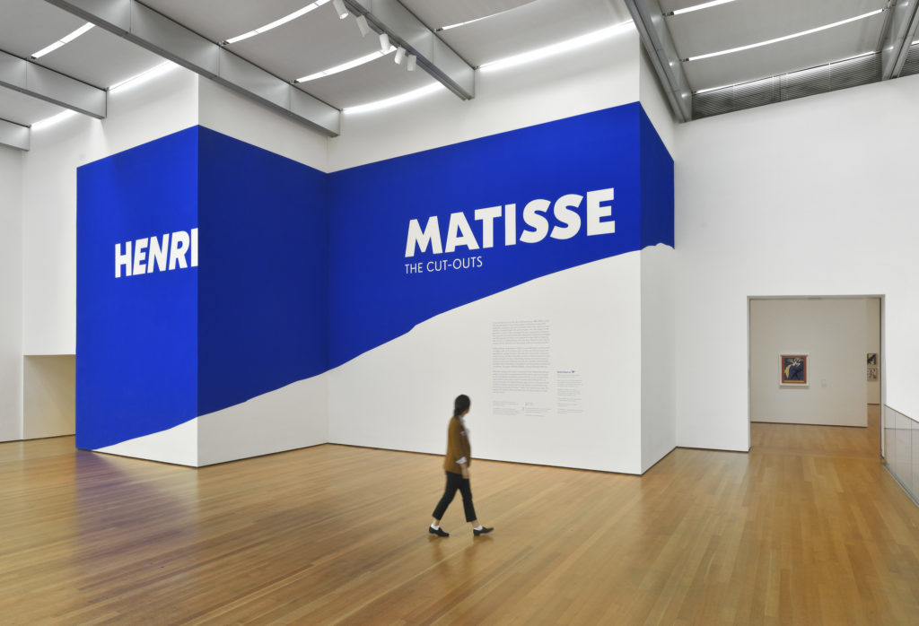
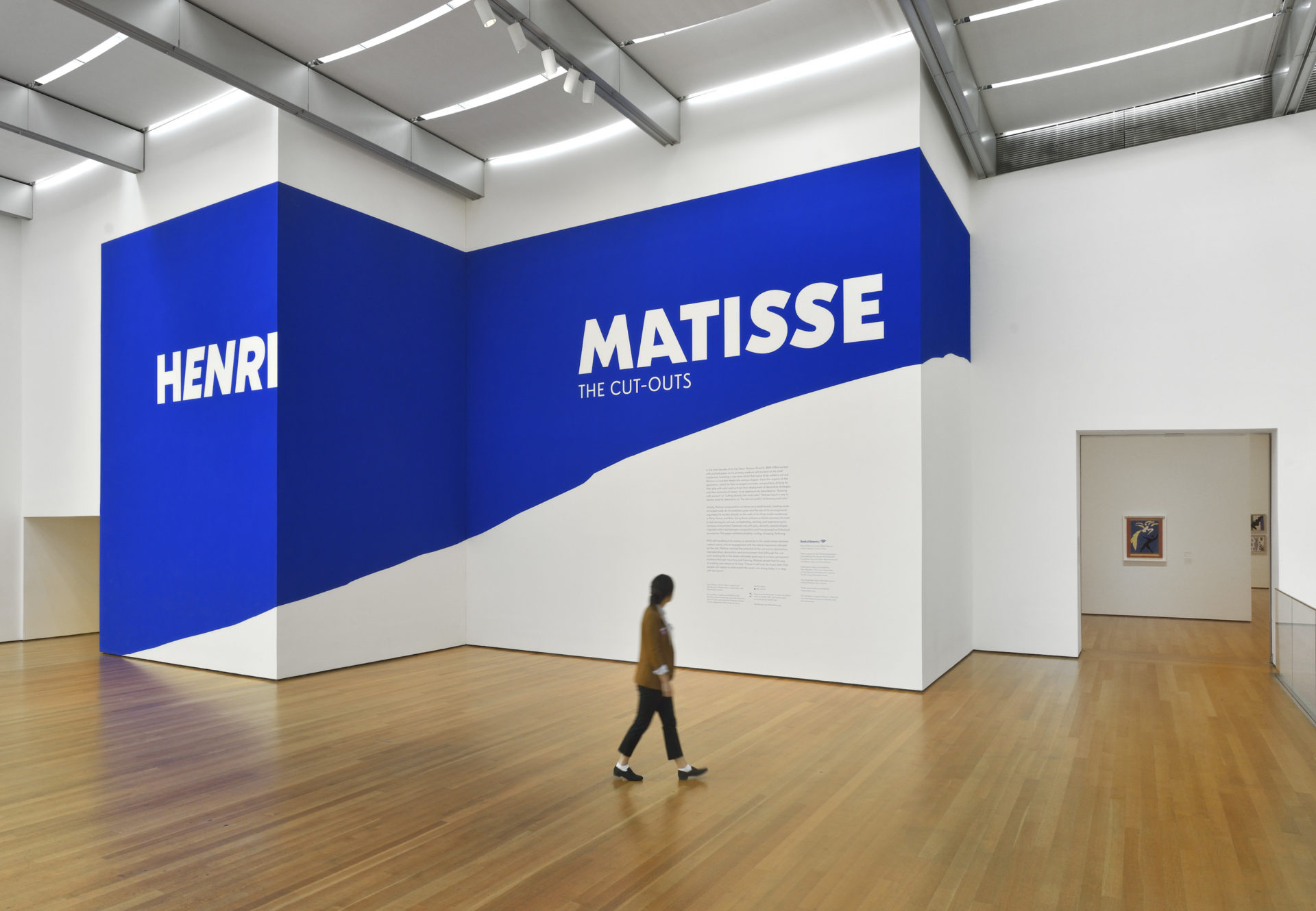
The most extensive presentation of the cut-outs ever mounted, the exhibition includes approximately 100 cut-outs along with a selection of related drawings, prints, illustrated books, stained glass, and textiles.
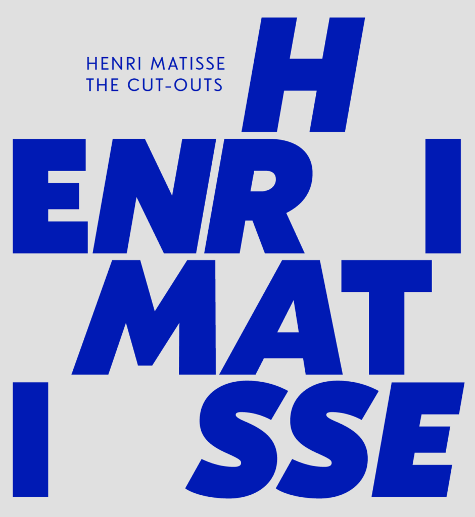
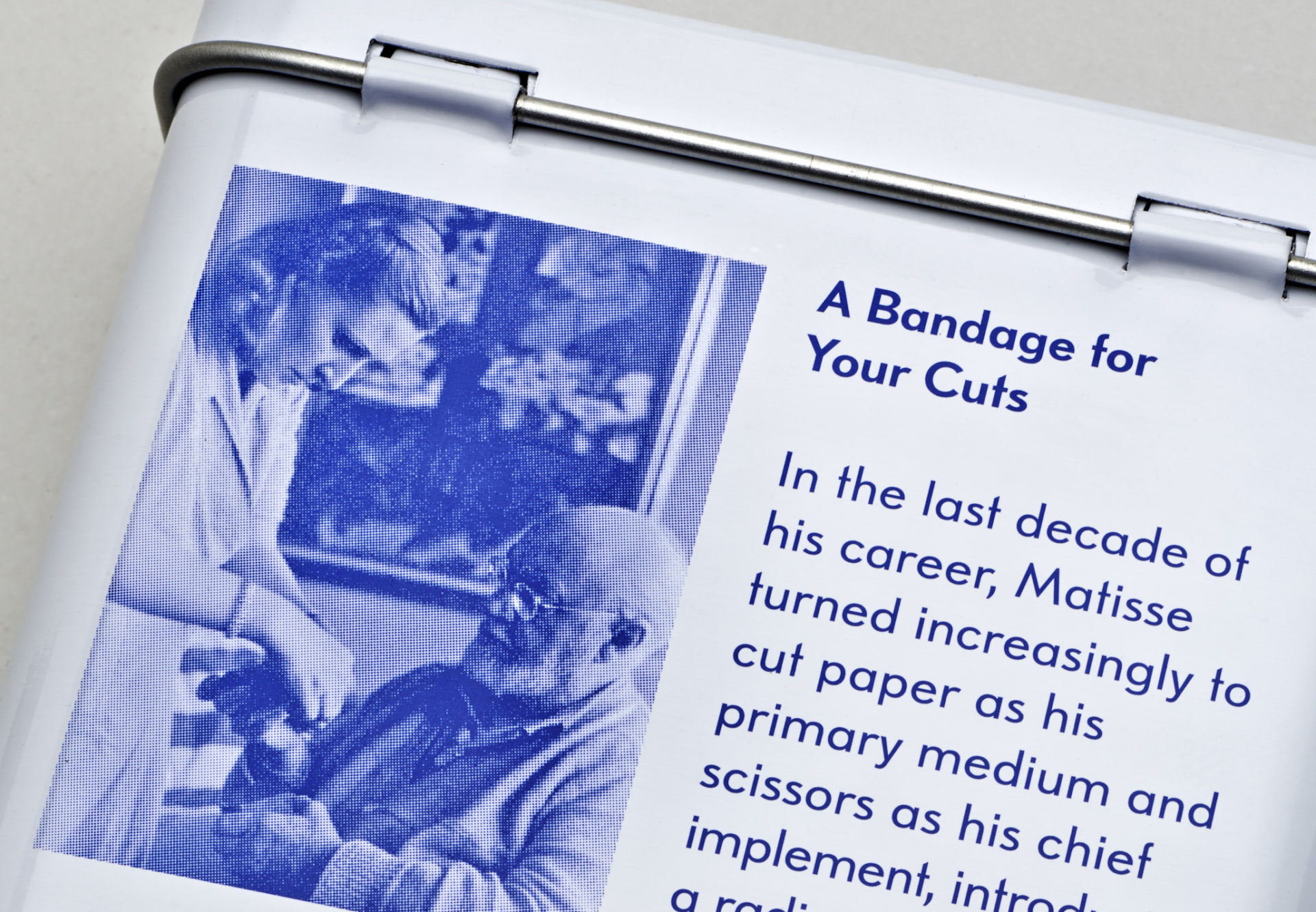
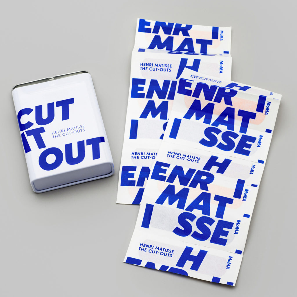
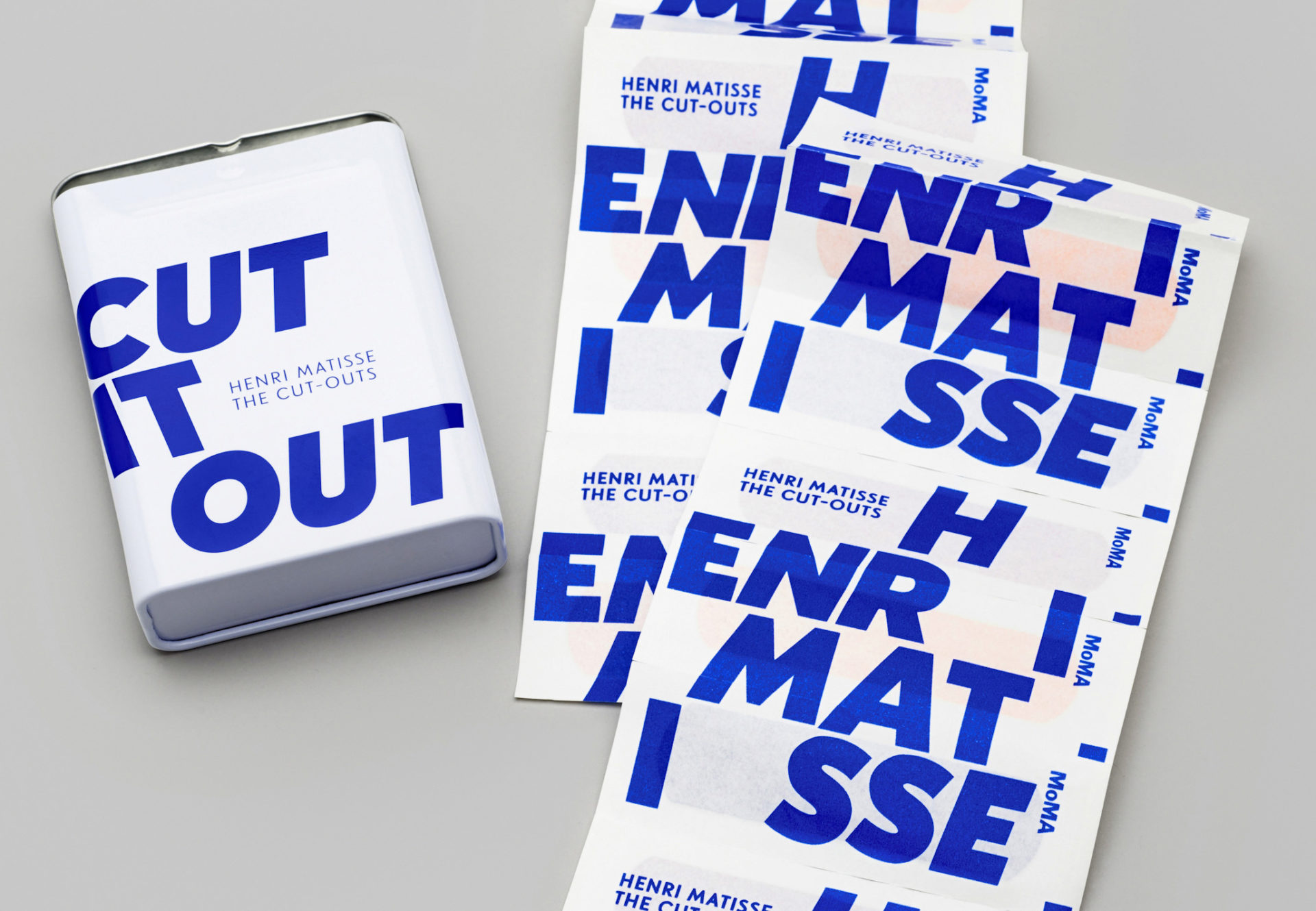
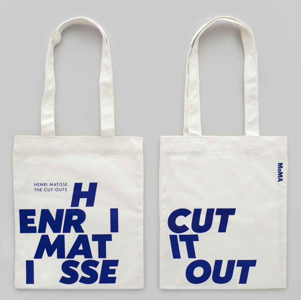
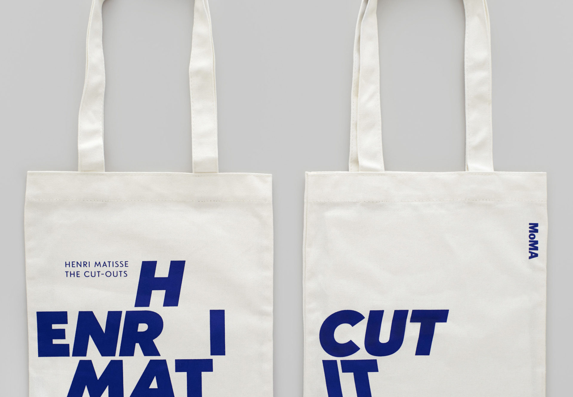
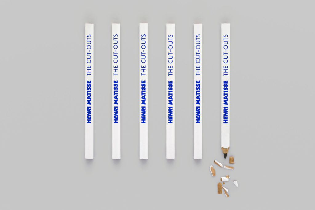
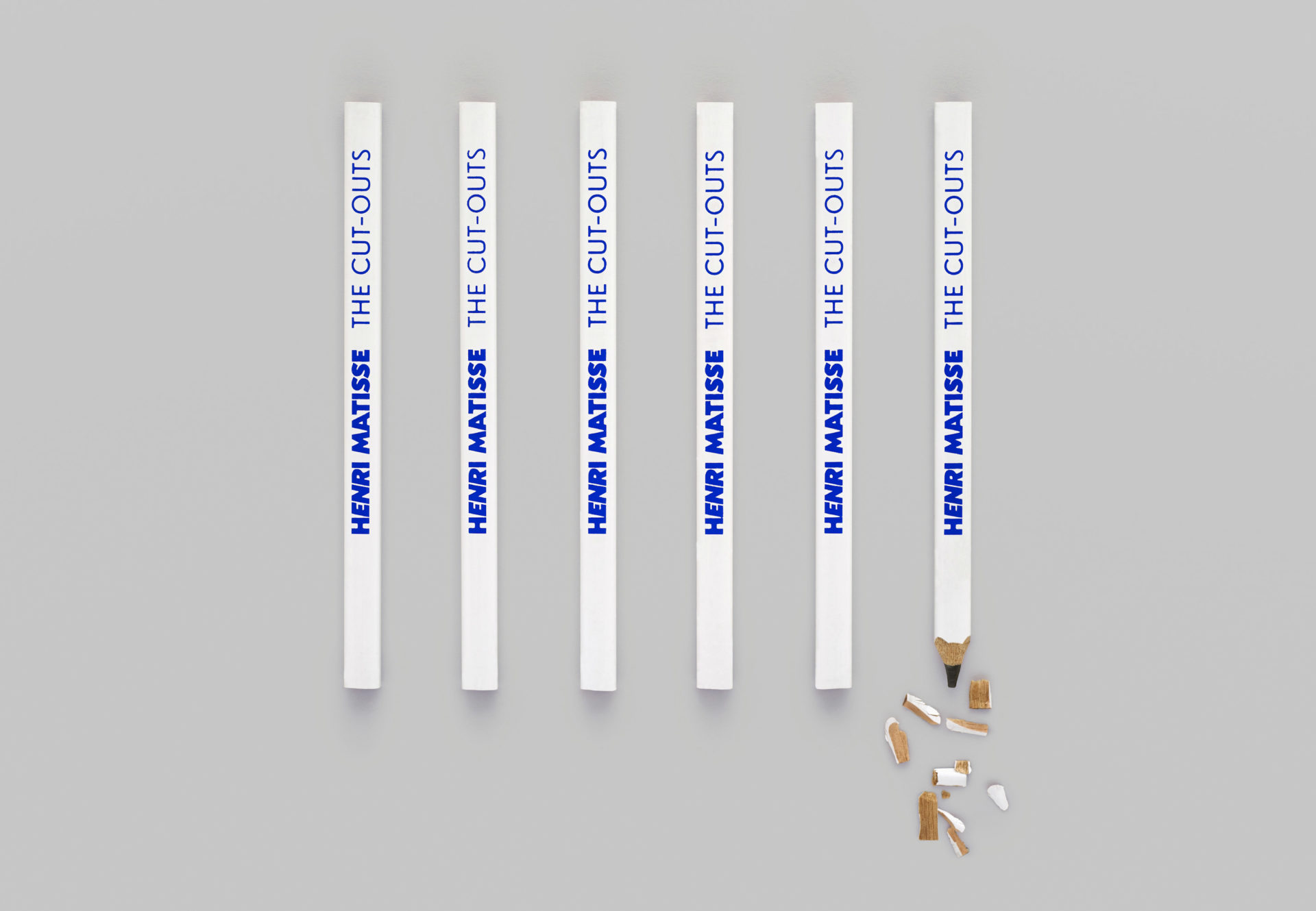
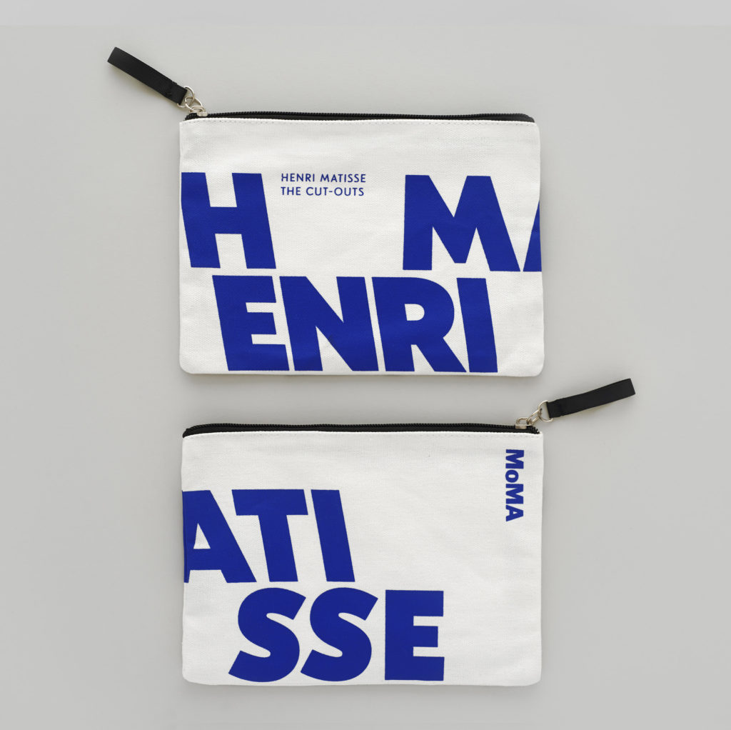
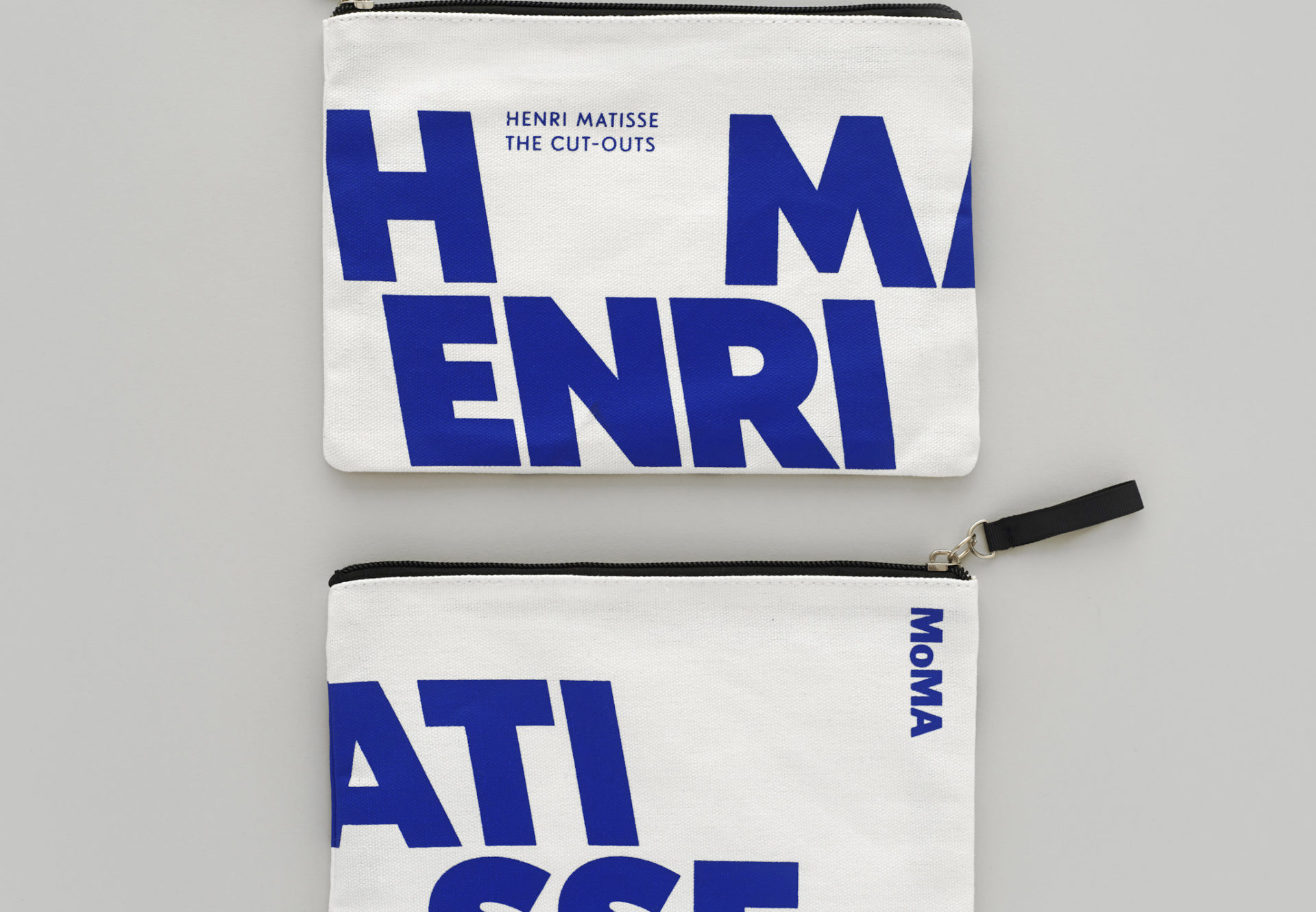
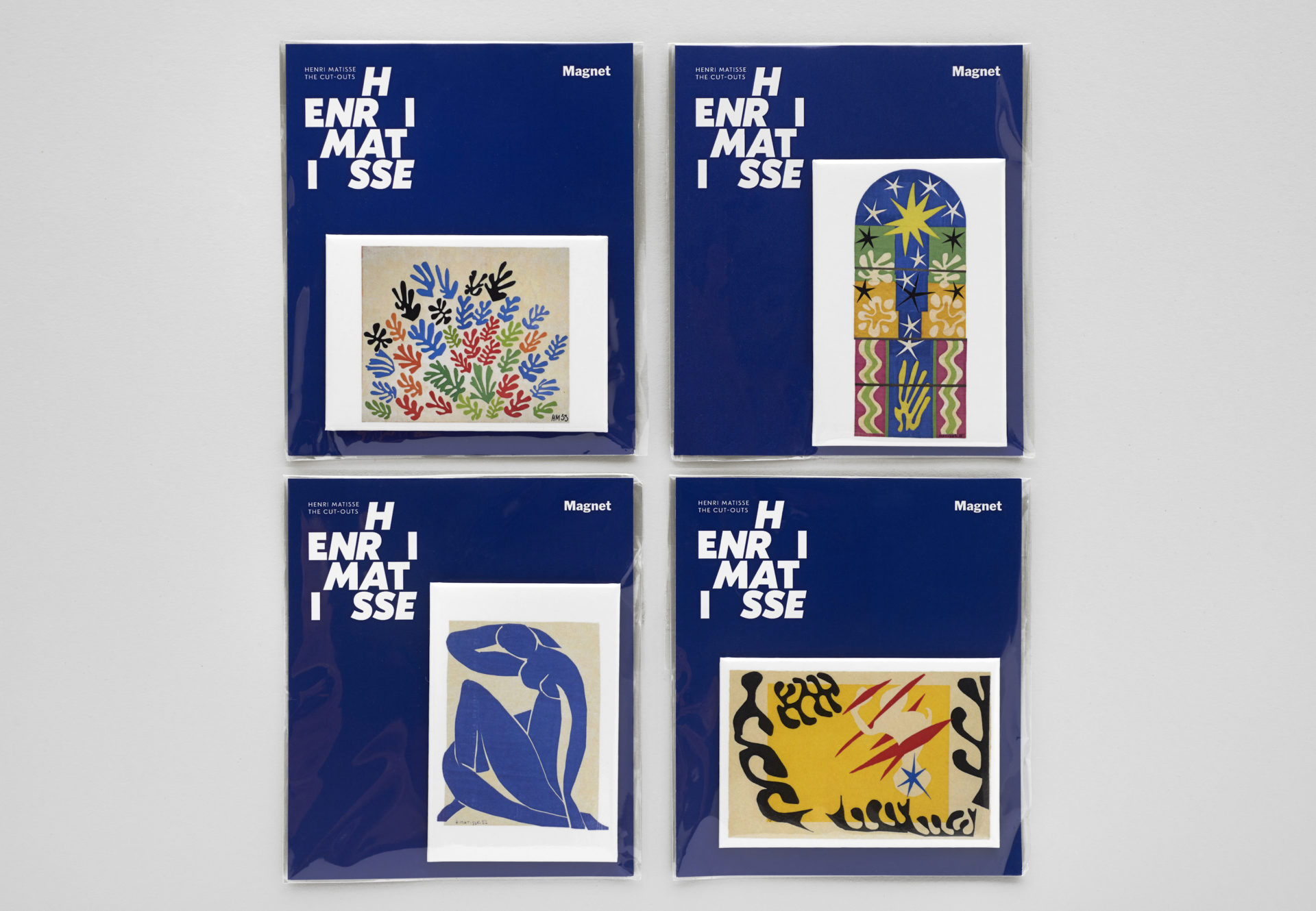
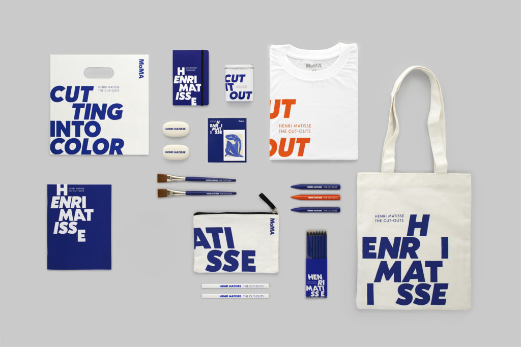
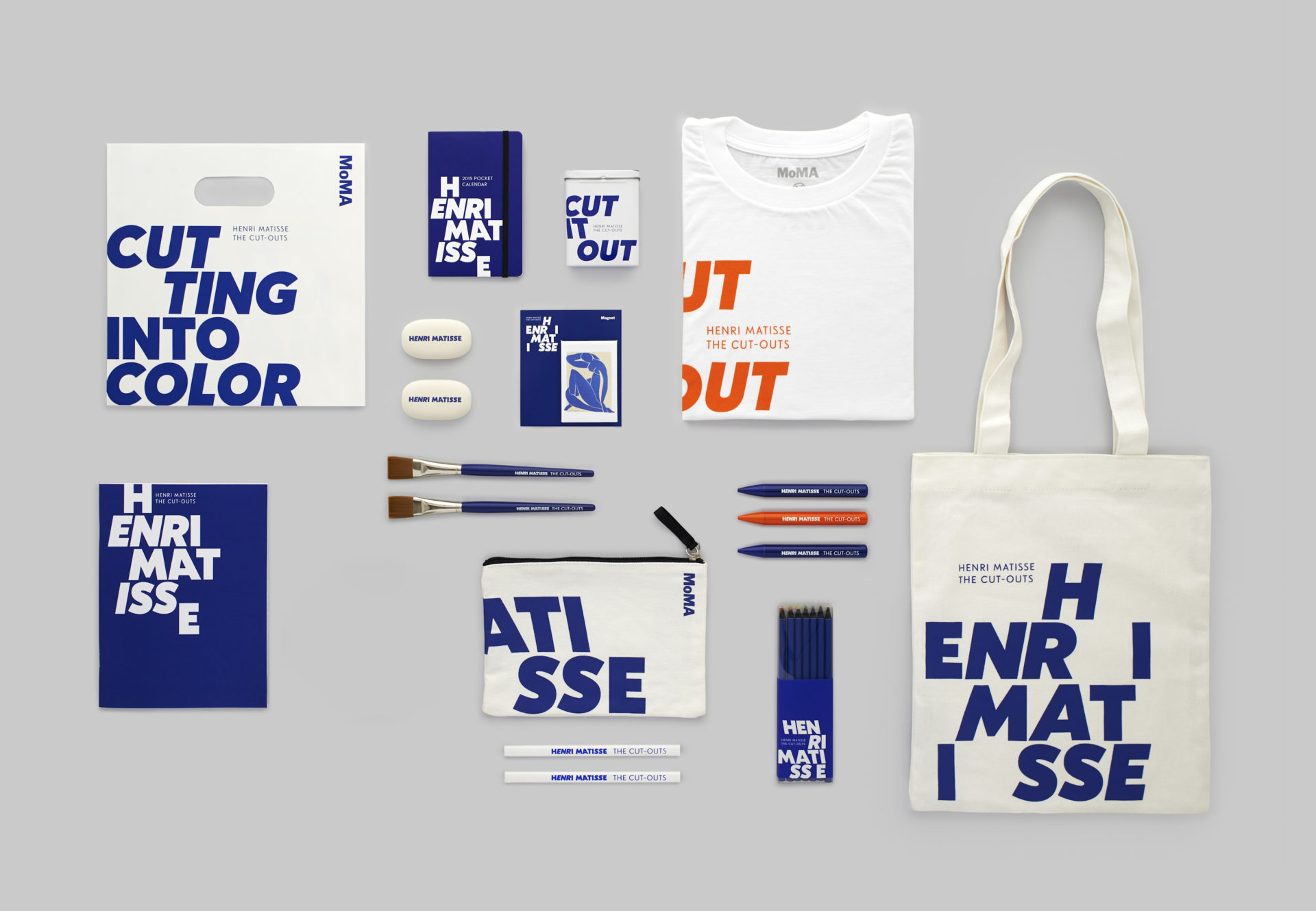
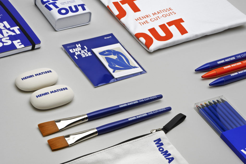
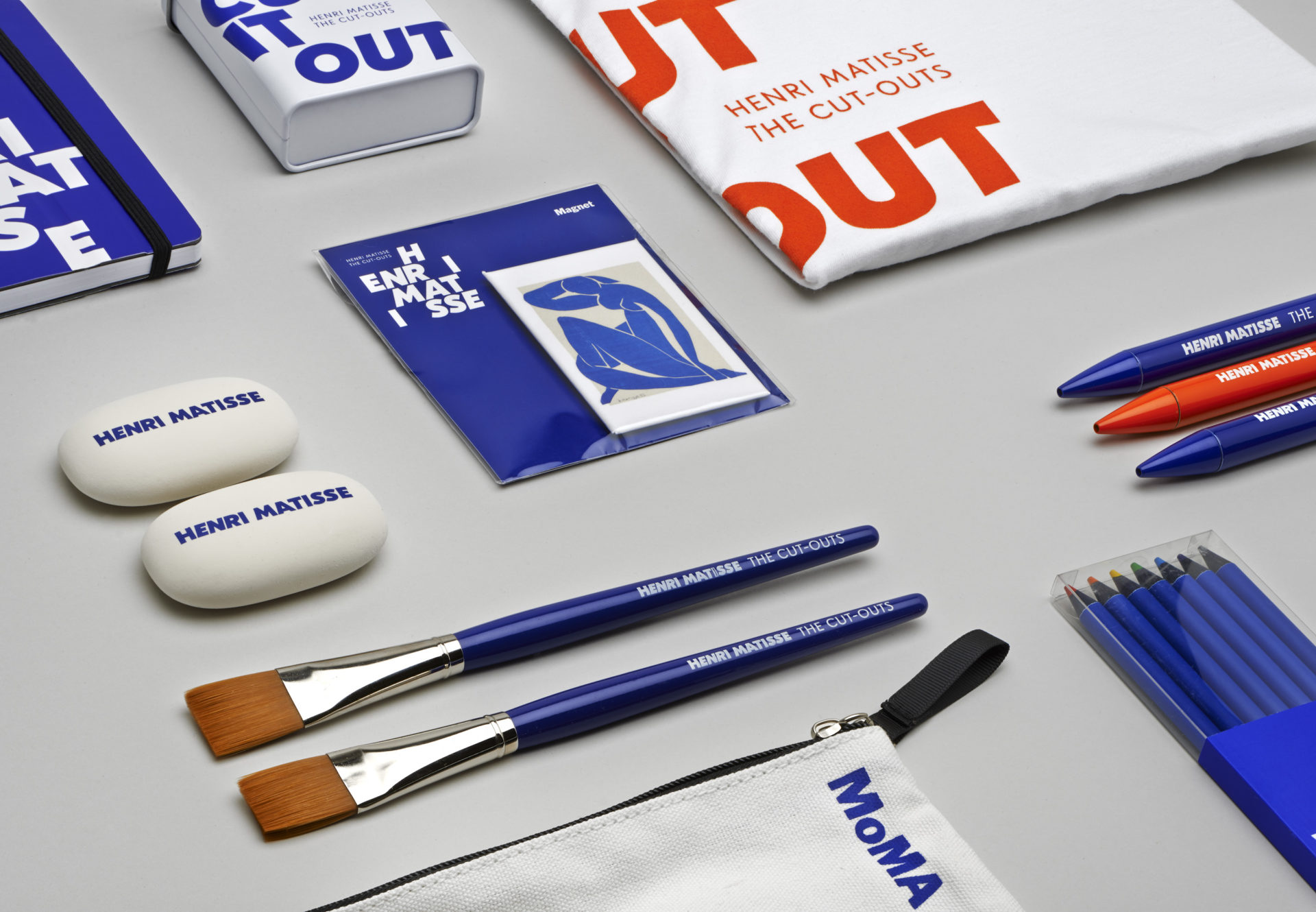
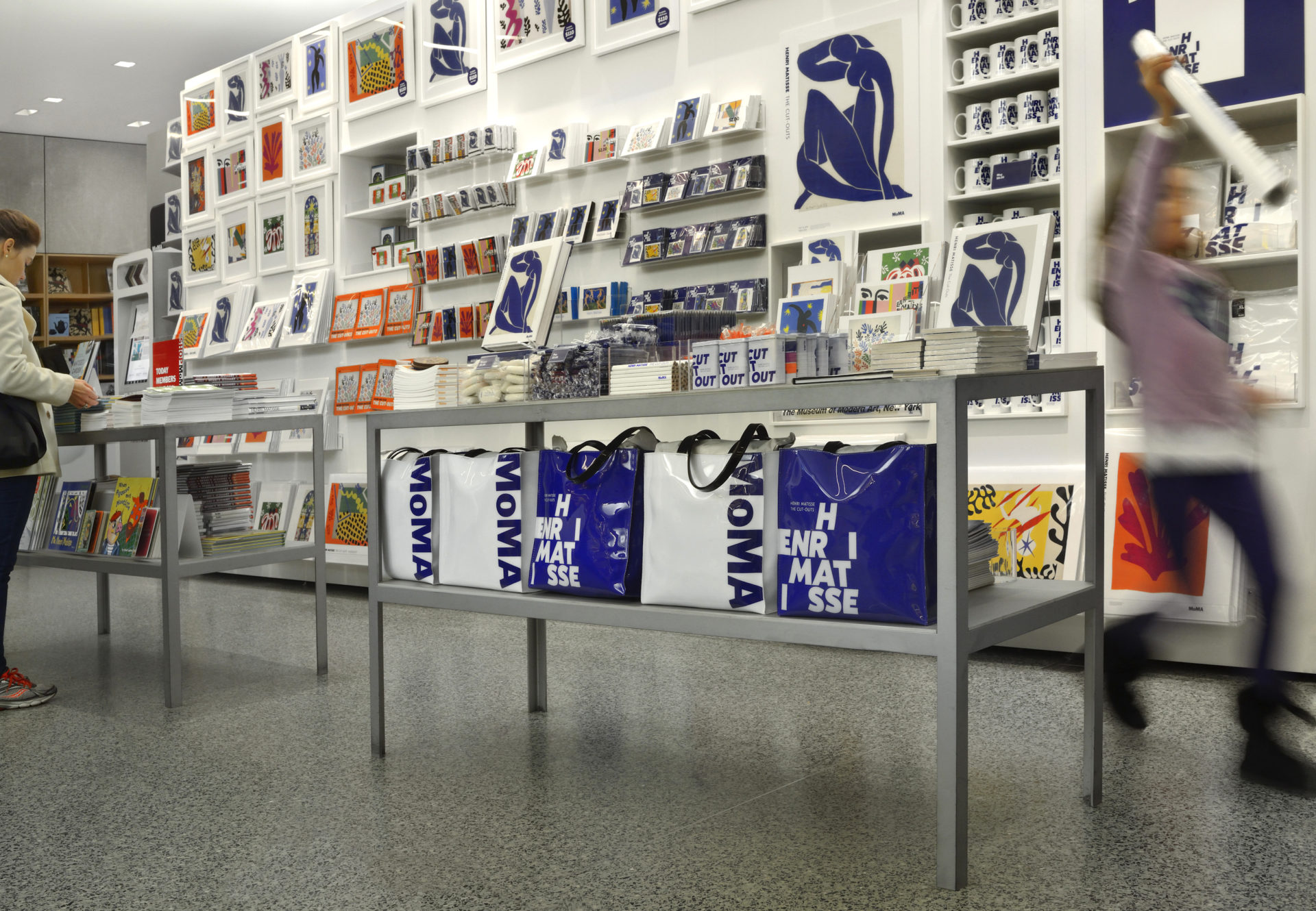
Matisse would cut painted sheets into forms of varying shapes and sizes — from the vegetal to the abstract — which he then arranged into lively compositions, striking for their play with color and contrast, their exploitation of decorative strategies, and their economy of means. The visual identity avoided using literal “cut-out” shapes and drew inspiration from arranging and composing with the cut-out shapes, an essential part of Matisse’s process. The result is a bespoke typeface family with roman, italic, and reverse italics, allowing for informal compositions that could move or change based on the environment or surface area. In addition, the typeface could express phrases from Matisse himself like “cutting into color“ and other engaging messages used in the retail experience (cut it out). The type system’s flexibility ideally suited the variety of retail merchandising needed for the MoMA Store.
Credits & details