


Summary
Belkin had lost their way and had become a “me too” brand rather than a leader. Their logotype lacked soul or an idea driving its form. Belkin needed to return to their roots — to make People Inspired Products (PIP). This idea had become a relic of the past. Wolff Olins believed the business needed to return to this idea as its core belief system once again. The PIP initials also happened to be the founder, Chet Pipkin’s nickname. Together, these ideas led the team to create a new symbol, logotype, and a new brand expression.
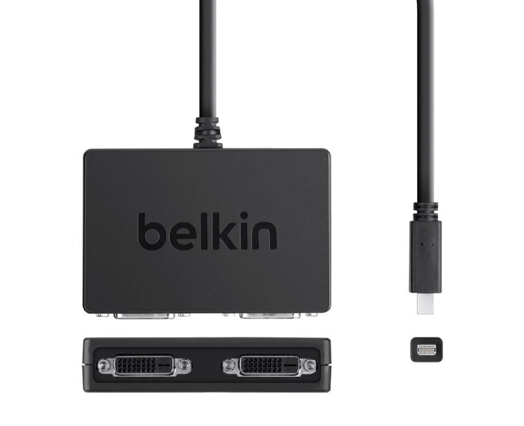
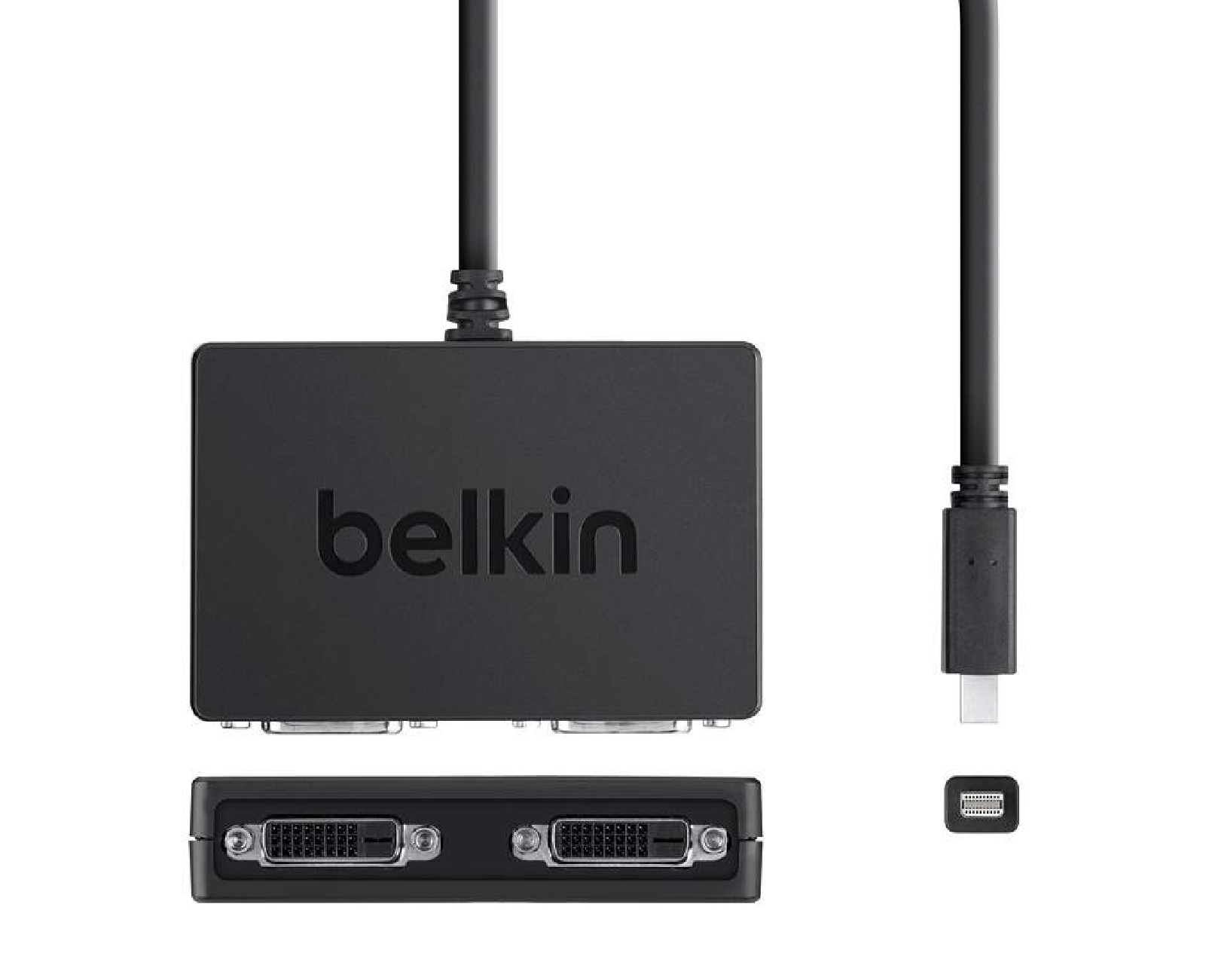
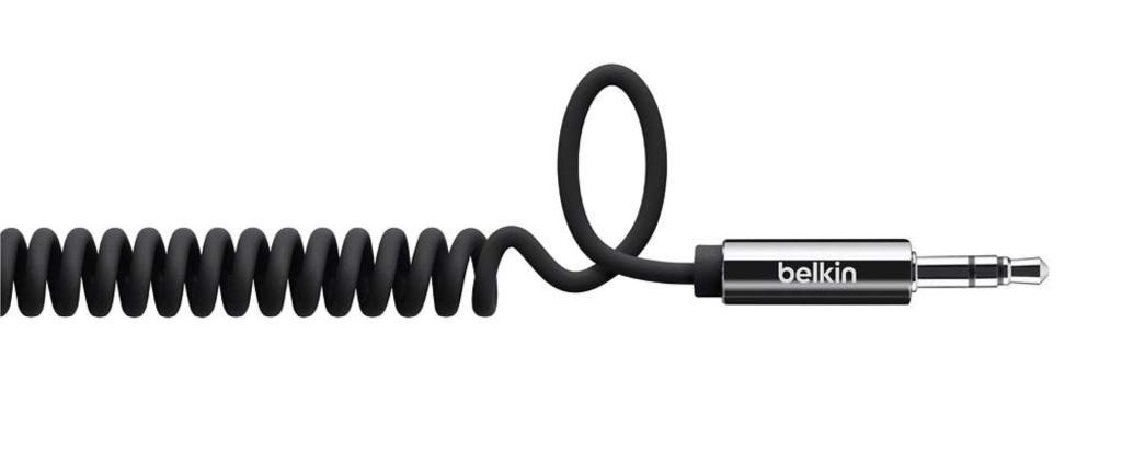
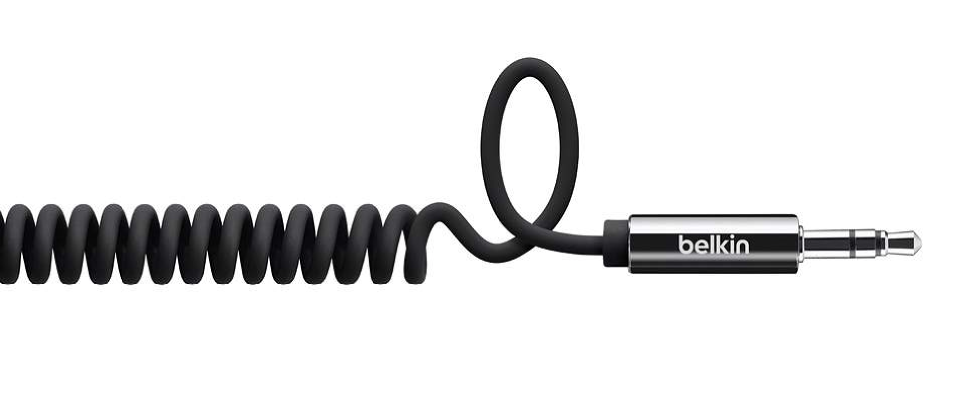
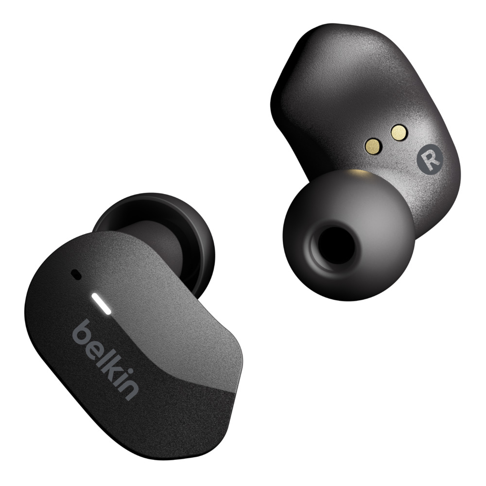
The wordmark is deliberately not geometric to avoid being overtly mechanical and losing its charm. In addition, we designed the identity system so the symbol and the logotype can be used together, separated, or individually. This choice enabled designers to choose the appropriate mark to deliver the best impact in tight real estate, such as earbuds and USB cords.
Credits & details