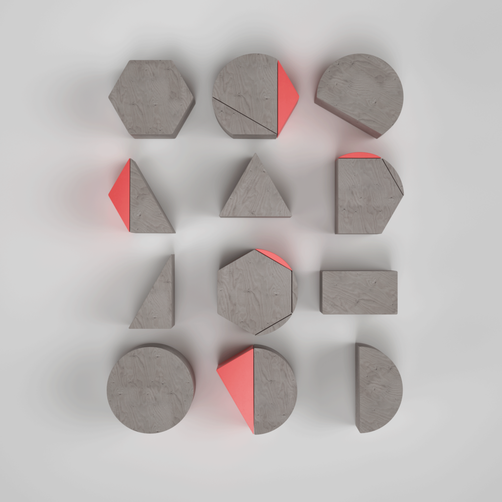
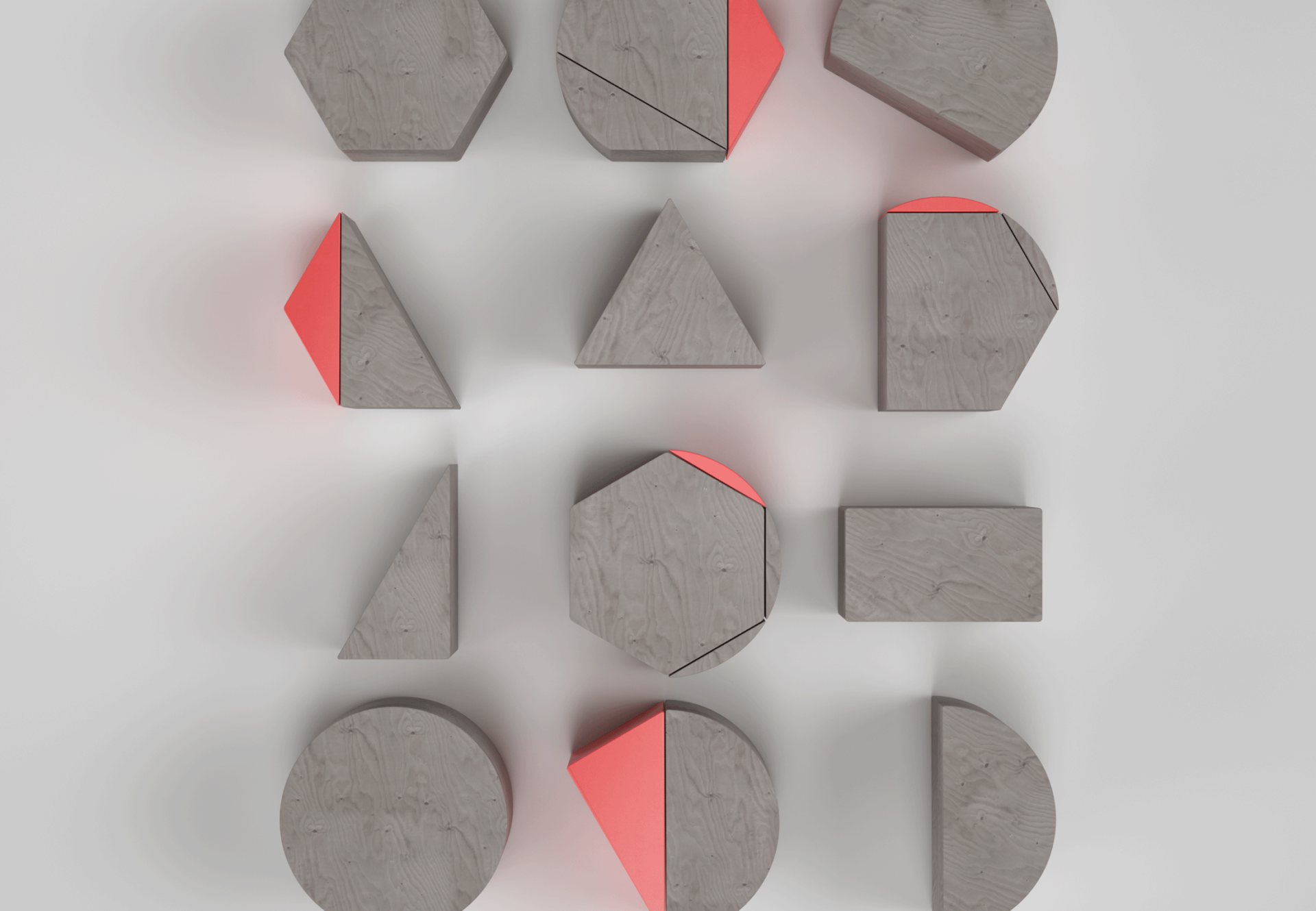
Shape renders


System

Video graphics kit
Photography direction


Summary
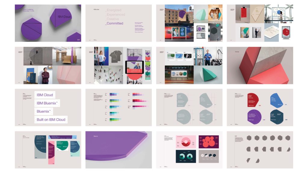
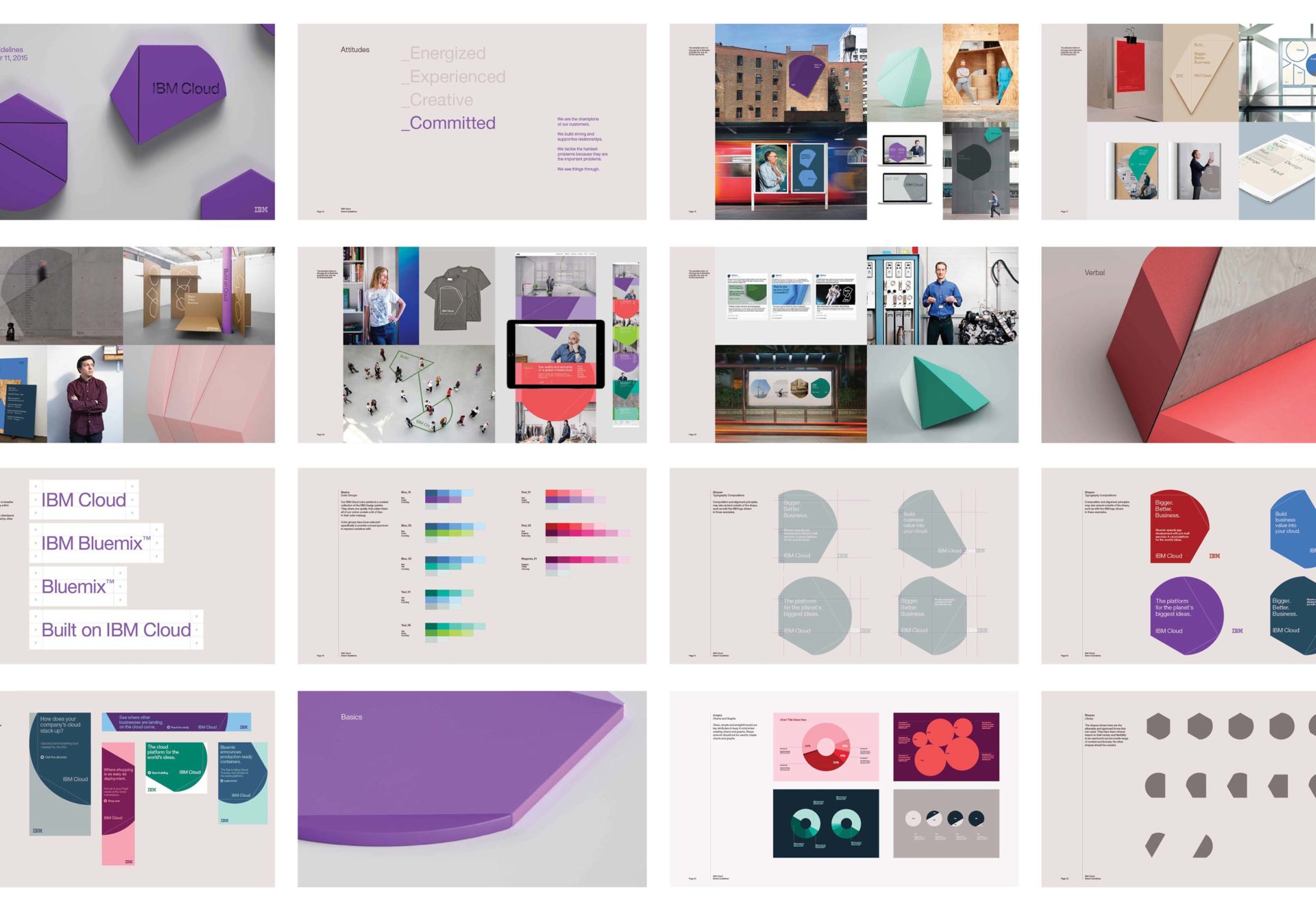
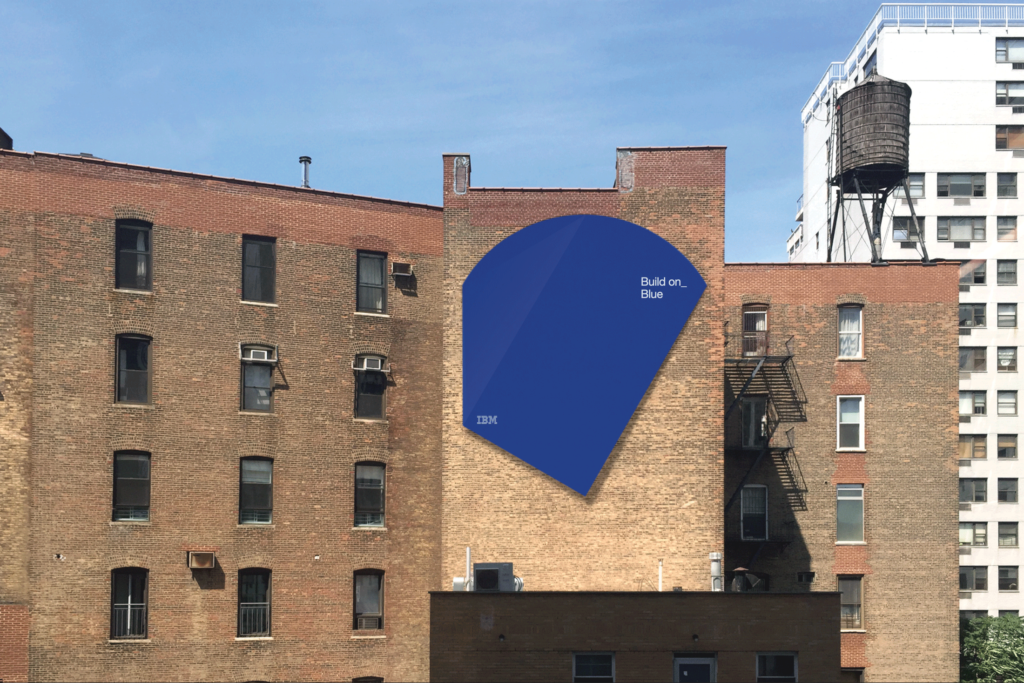
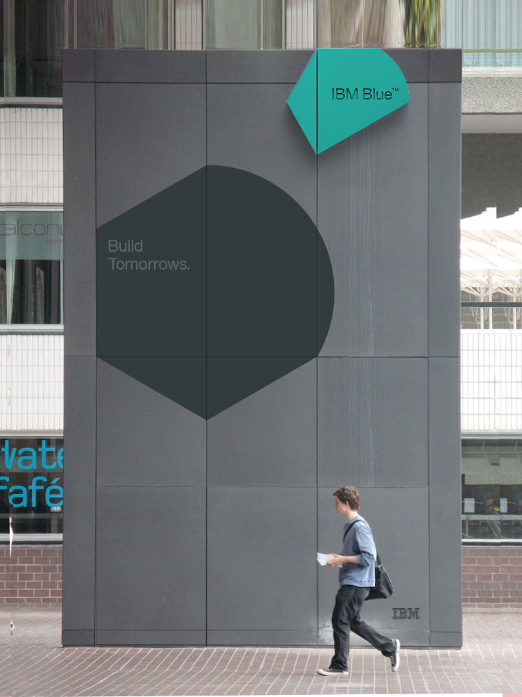
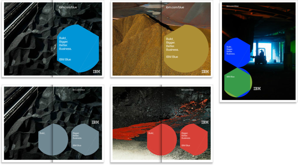
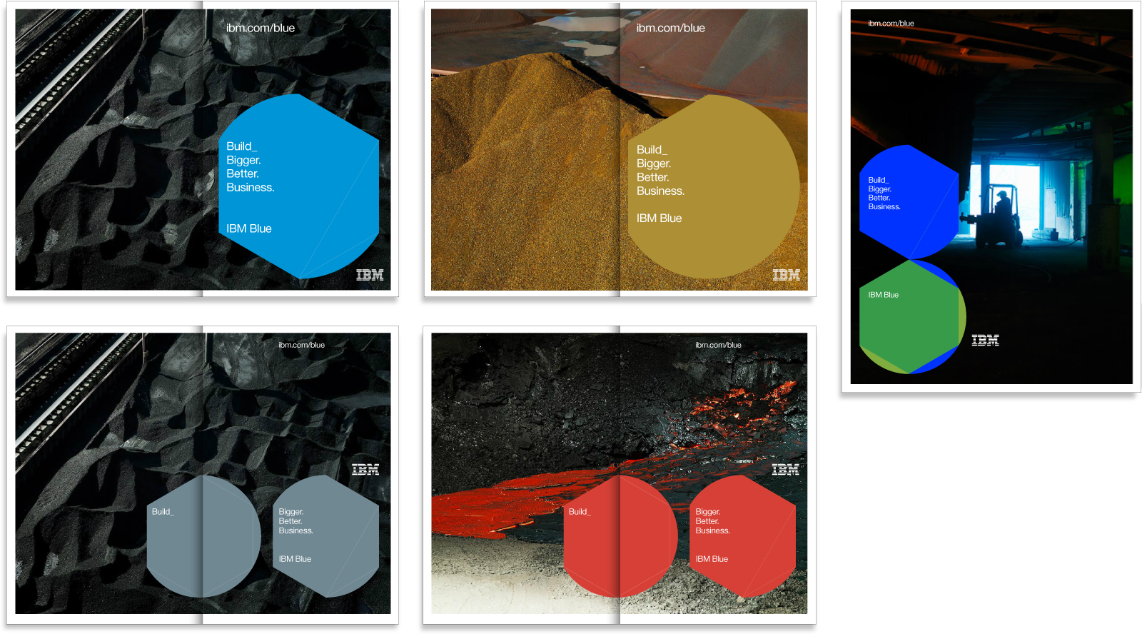
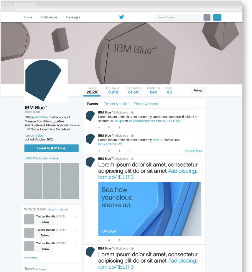
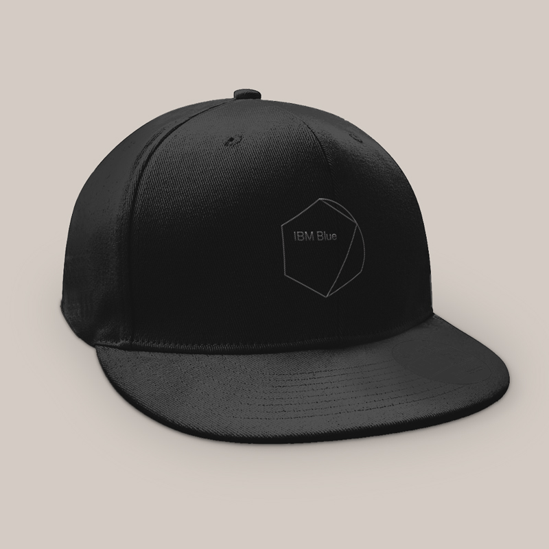
This extensive brand investigation for IBM Cloud included exploring an alternative name, IBM Blue, which leadership would decide at the end of the project. However, the system designed could accommodate either since its underlying concept celebrated the people the brand served and depended on — the engineers and developers— the builders.
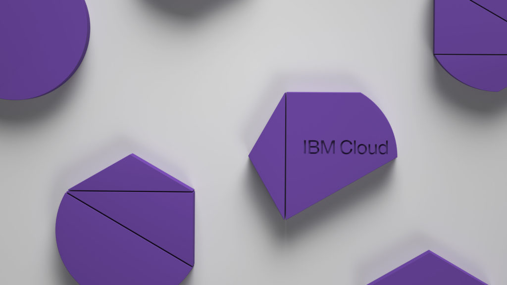
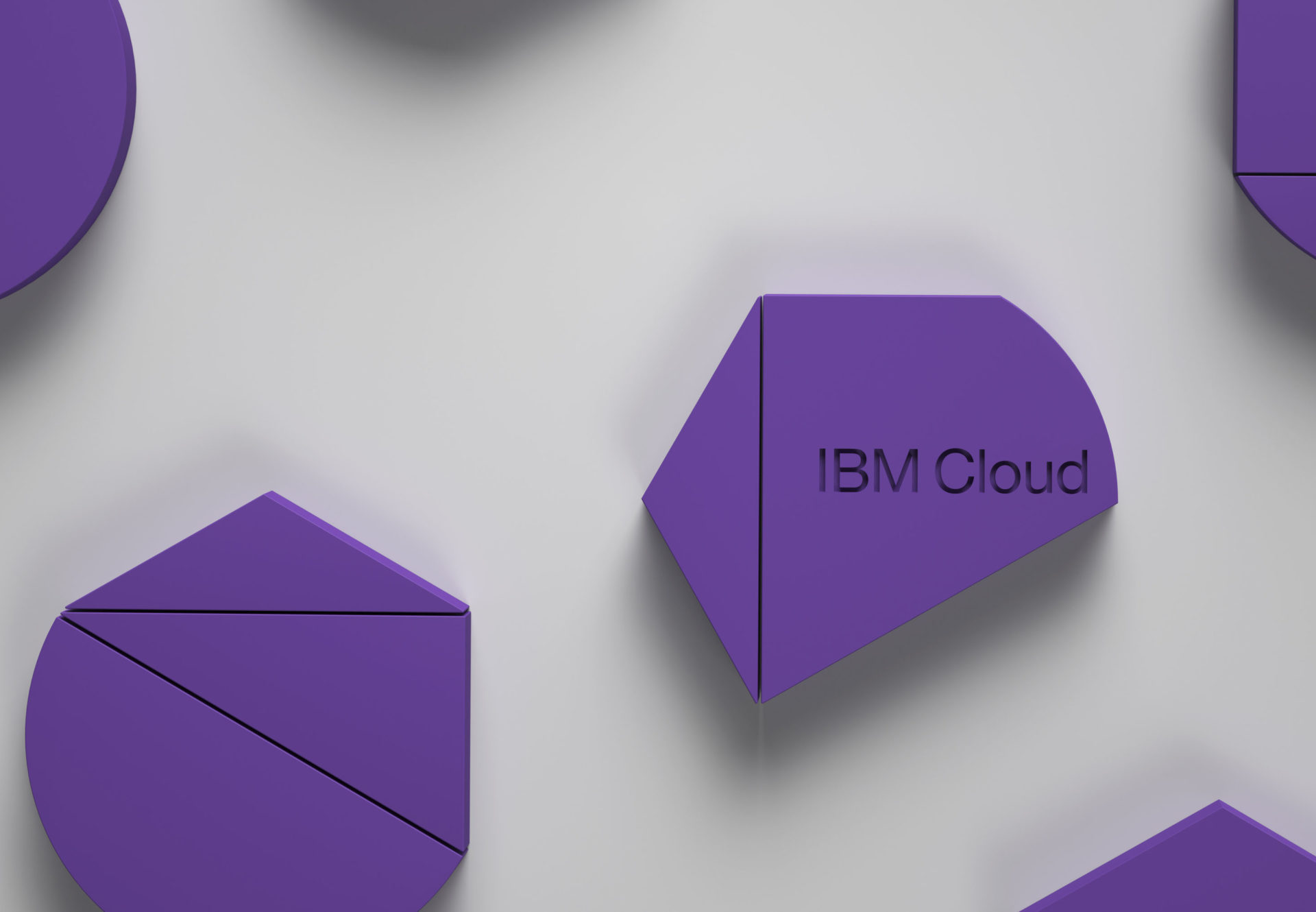
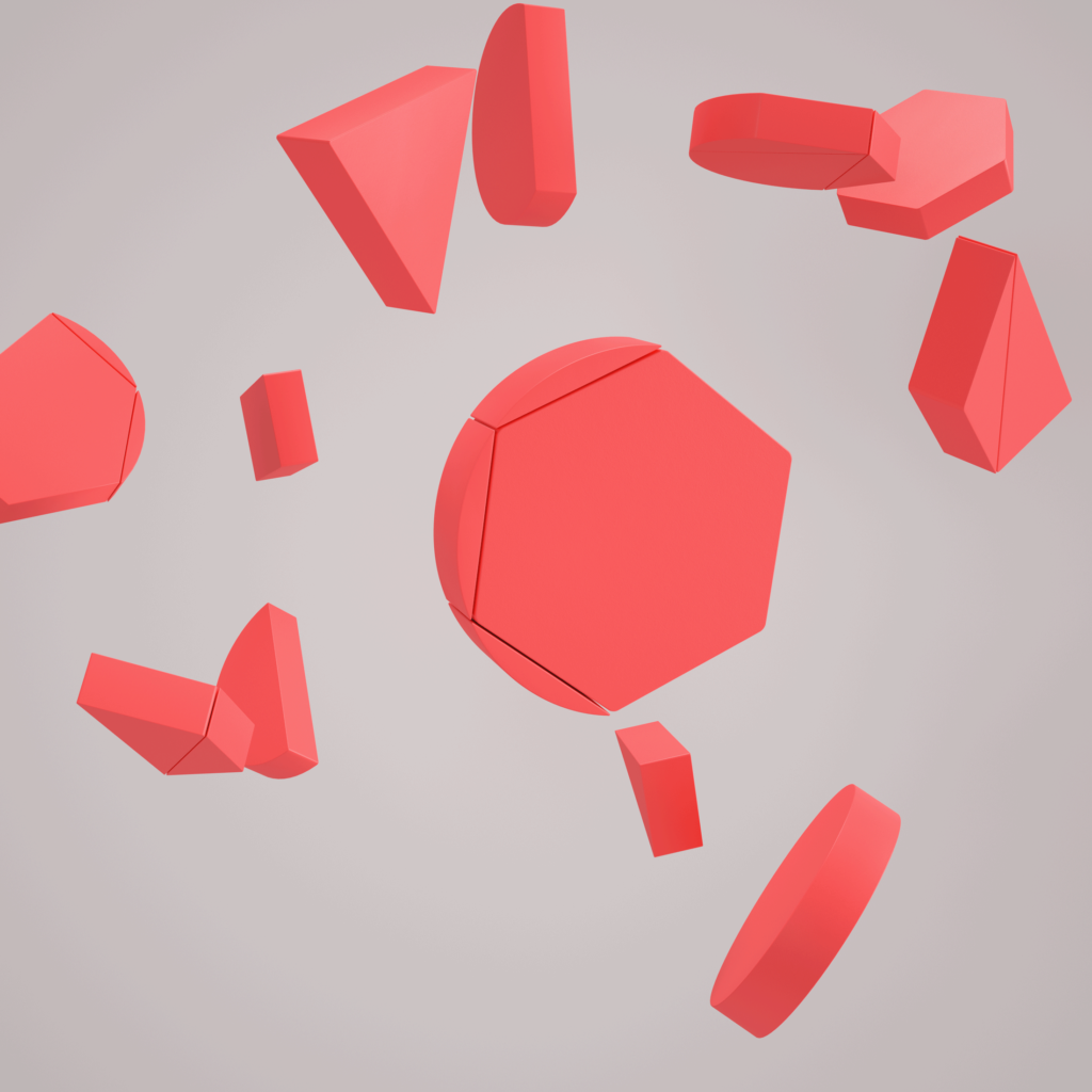
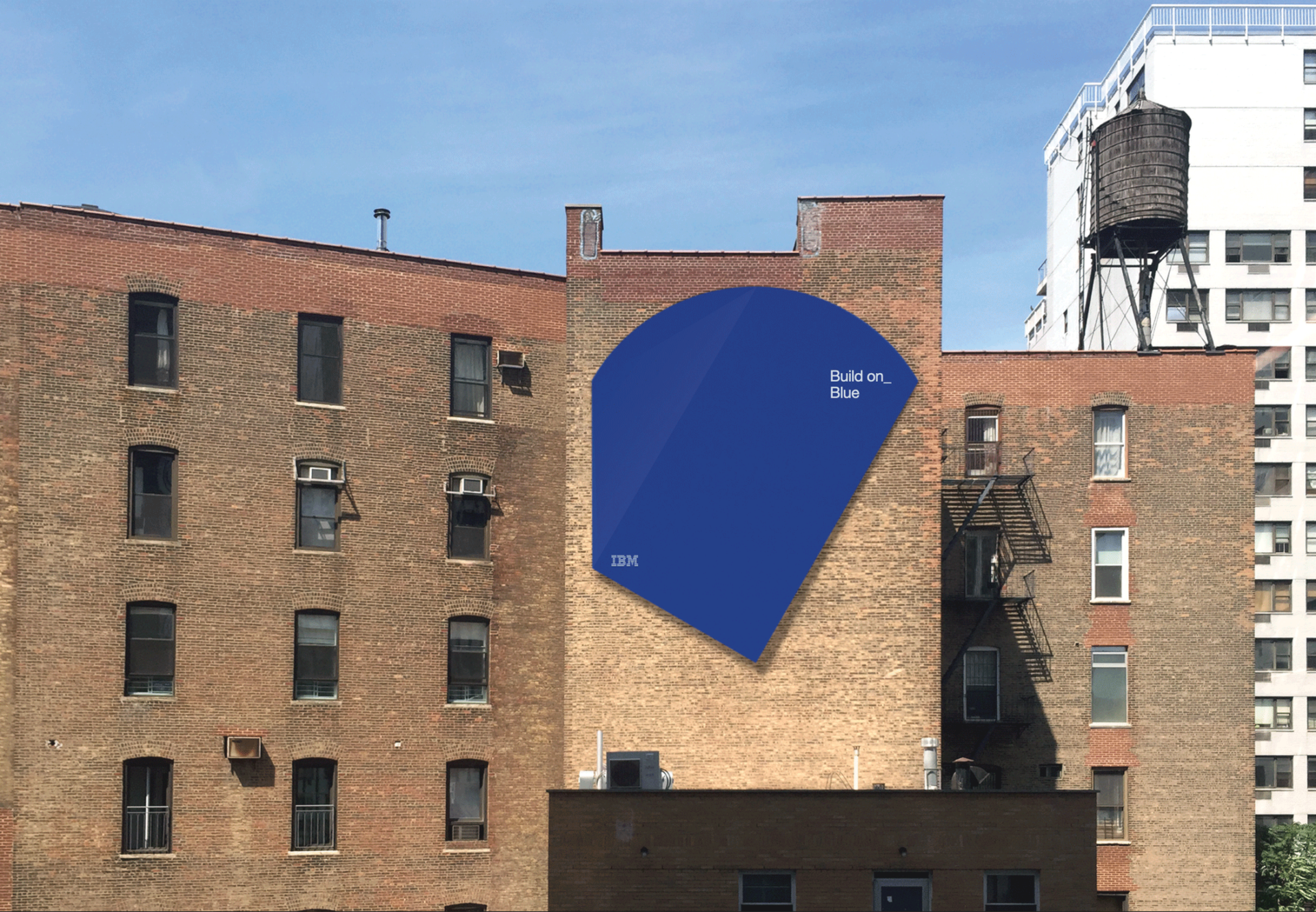
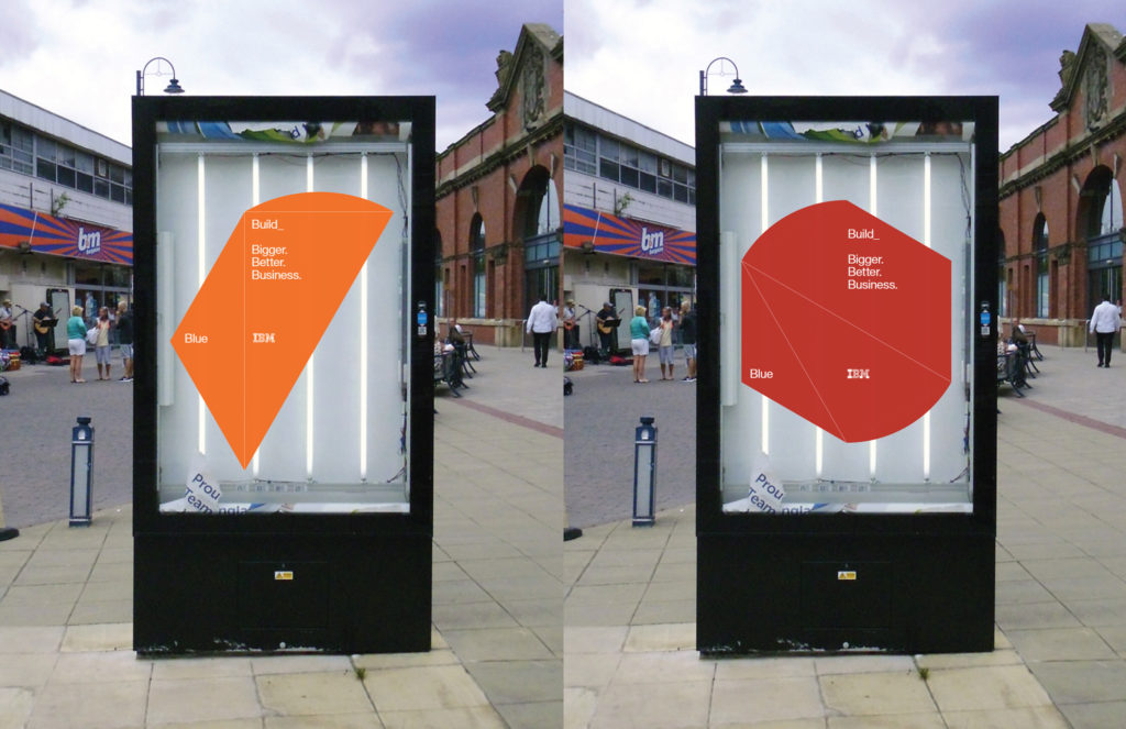
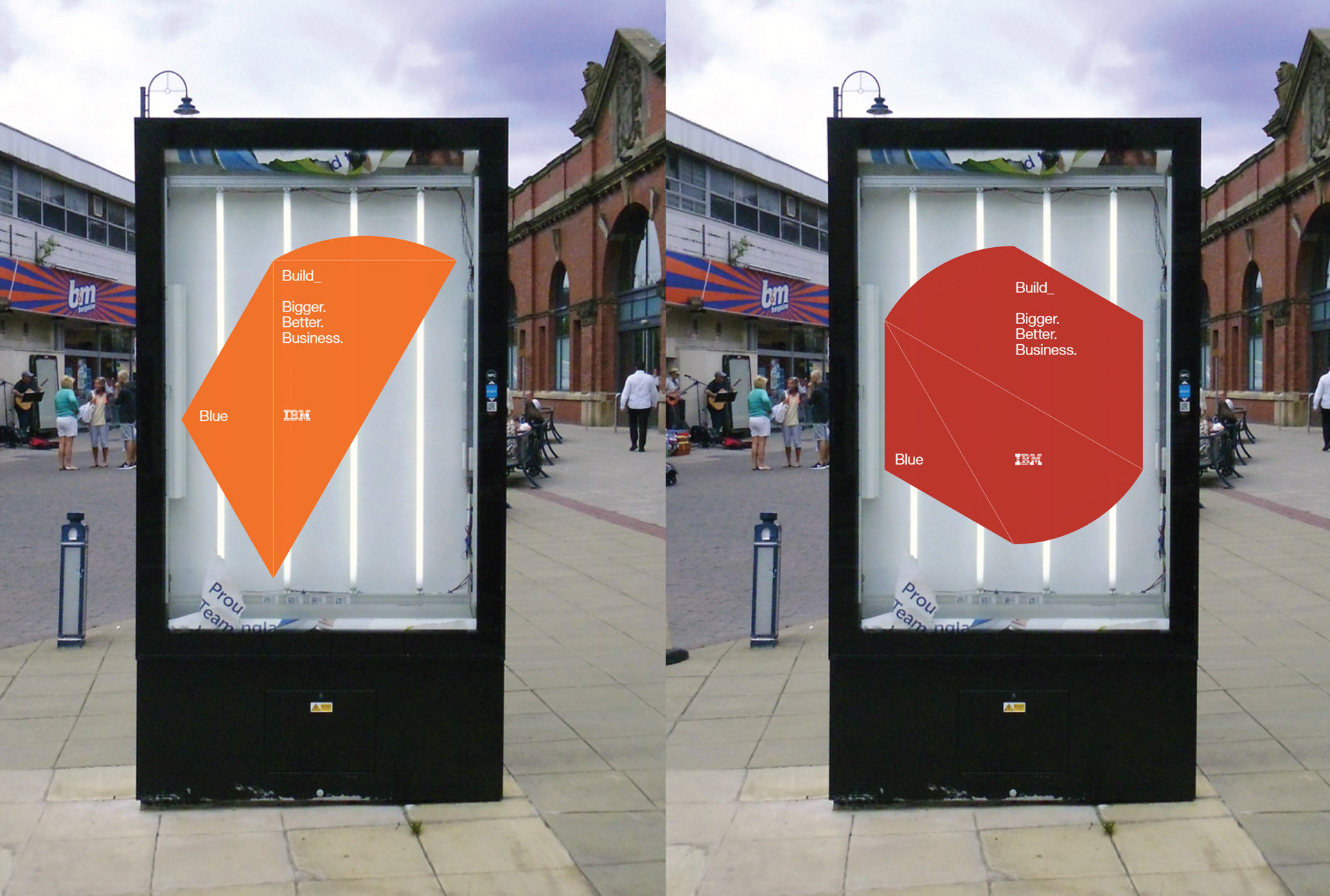
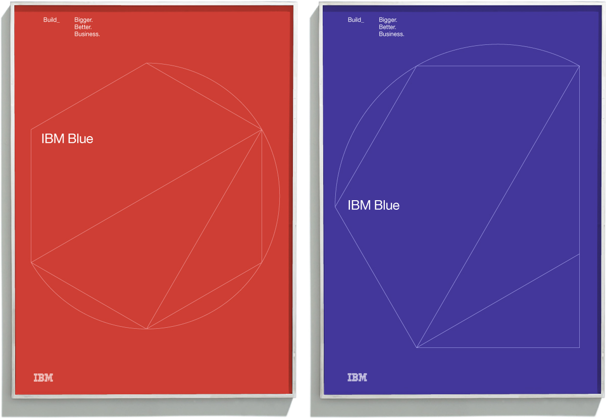
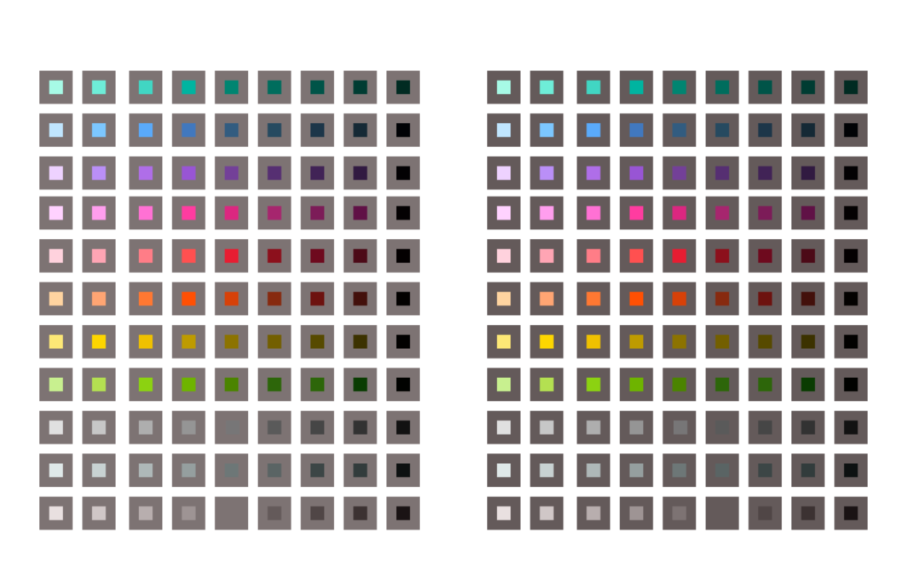
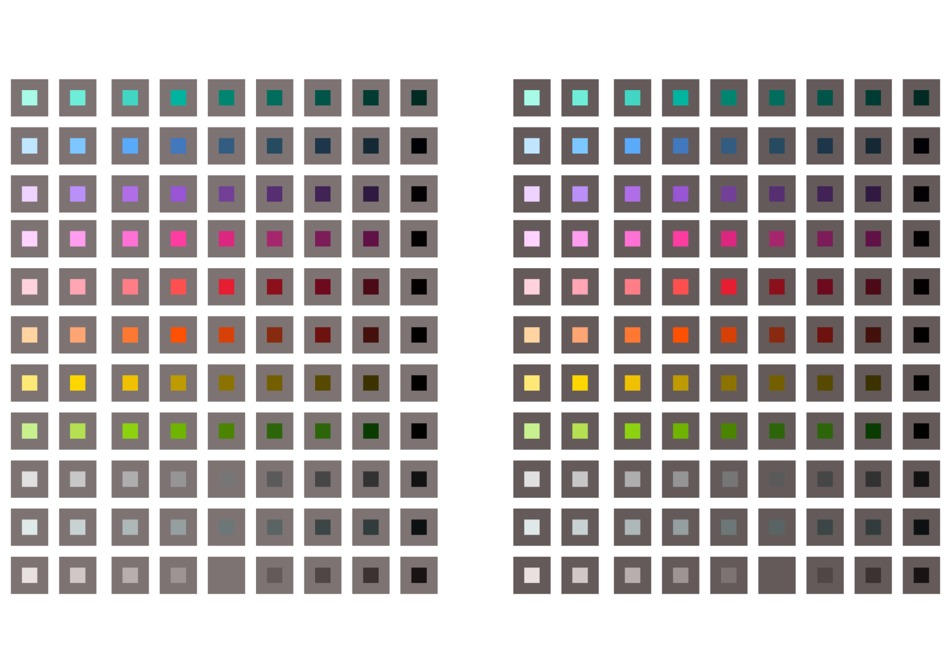
The resulting brand identity system is born from the intersection of two pure forms — the circle and the hexagon — both known elements of the IBM design language and symbolized building. Drawing intersecting lines between the outer points of these shapes, we yielded a wide range of unique shapes that create the entire system’s architecture. These “shapes” led everything from composition to layout to motion. We sought to humanize and poeticize the digital genetics of the Internet and the individuals who define it. The whole system was brought to life by our design partners Athletics and CATK.
IBM Design
Design partners